Radix Colors
Colour scales designed for real UI, with light and dark modes that actually match.
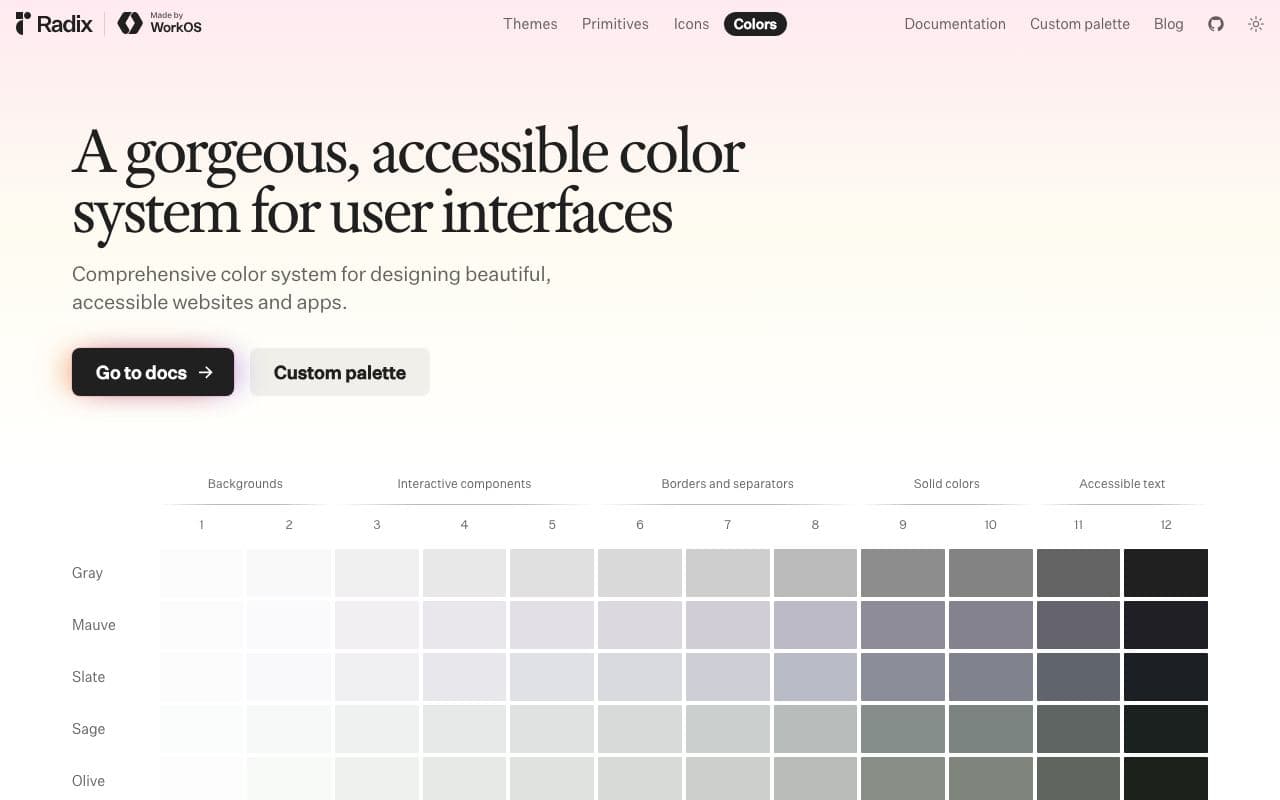
What it is
Radix Colors is a system of 12-step colour scales (30 colours, each with light, dark, alpha and P3 variants) where each step has a defined purpose: backgrounds, borders, solid fills, text. Because every scale follows the same structure, swapping accent colours or themes just works.
Why it’s here
The most useful thing about it is the documentation of what each step is for. Once you know step 9 is the solid colour and step 11 is text, dark mode stops being guesswork. Works with any framework; it's just CSS variables.
Best for
- colour systems
- dark mode
- accessible palettes
- design tokens
Can my agent use this?
Agent excellent agent friendlinessYes. Docs explain the meaning of each step; ask your agent to use Radix Colors scales and to follow the documented step usage for backgrounds, borders and text.
Excellent: Public docs, public source or an installable package. An agent can read, install and implement this directly.
Access methods
- Docs
- GitHub
- npm
Install
npm install @radix-ui/colorsRelated resources
UI Colors 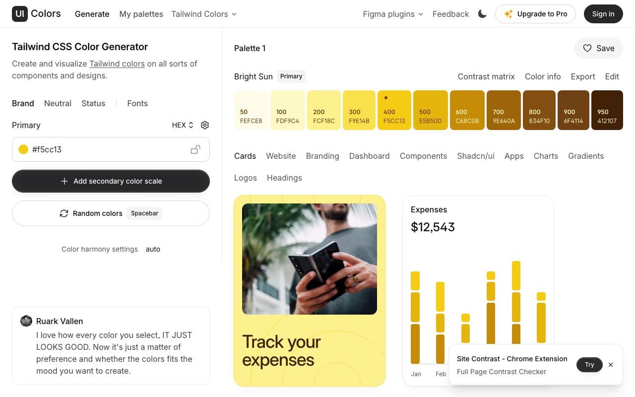
UI Colors
Turn one brand colour into a full Tailwind-style shade scale.
good agent friendlinessToolFreetweakcn 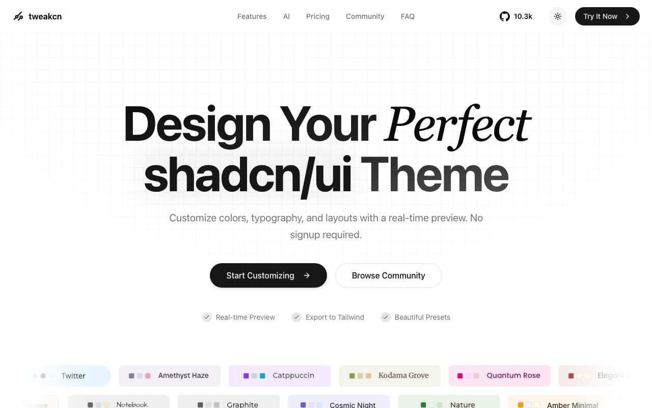
tweakcn
A visual theme editor that makes a shadcn/ui app stop looking like every other shadcn/ui app.
good agent friendlinessToolFreeOpen sourceStaff pickUsed by meDark Mode Design 
Dark Mode Design
A gallery of websites that get dark interfaces right.
limited agent friendlinessGalleryFreeIconify 
Iconify
One API and one component for two hundred thousand icons from every major set.
excellent agent friendlinessAsset libraryFreeOpen source