Pack For people who ship
Editorial Landing Page
A marketing page that reads like a magazine. Type first, one warm accent, no blob.
A contract for landing pages that are better explained than demoed. A large serif headline with real optical sizing, generous whitespace, warm paper, one burnt-orange accent and images that sit in the grid. It replaces the centred-headline-and-three-cards layout every agent reaches for with something you would actually read.
Look at the reference screens before you write a word of prompt, so you are describing something real. Install the pack, then pull sections from Magic UI sparingly and logos from SVGL. Typewolf shows the type in use; Fontsource installs it. Run the check before you show anyone.
- Type
- Fraunces + Manrope
- Colours
- 12 tokens
- Stack
- Framework agnostic, Tailwind CSS
- Checks
- /
For agents: this pack as markdown · install manifest
Reference screens
Look at these before you write a prompt, so you’re describing something real. Take the principle, not the pixels.
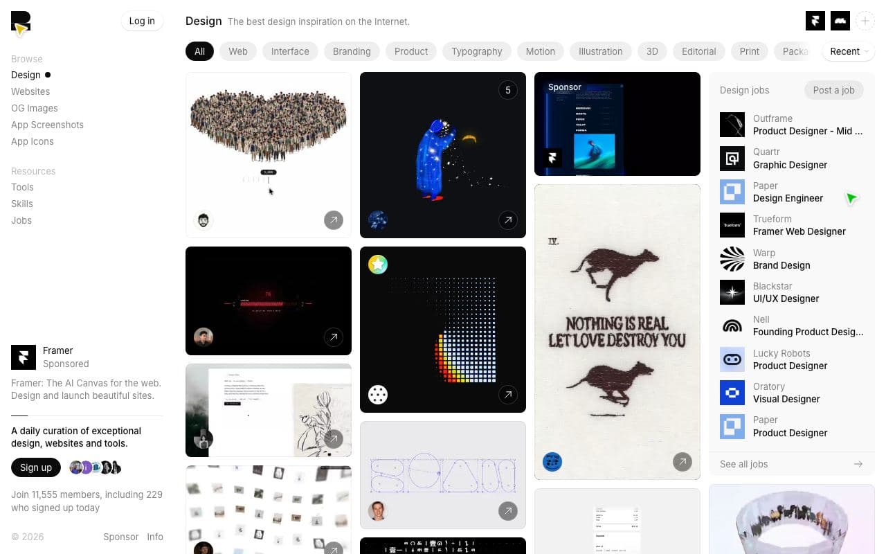
Godly
The gallery to open first. Nearly everything on it shows what restraint and good type look like on a real page.
Look at: headline scale, margins, how few elements sit above the fold
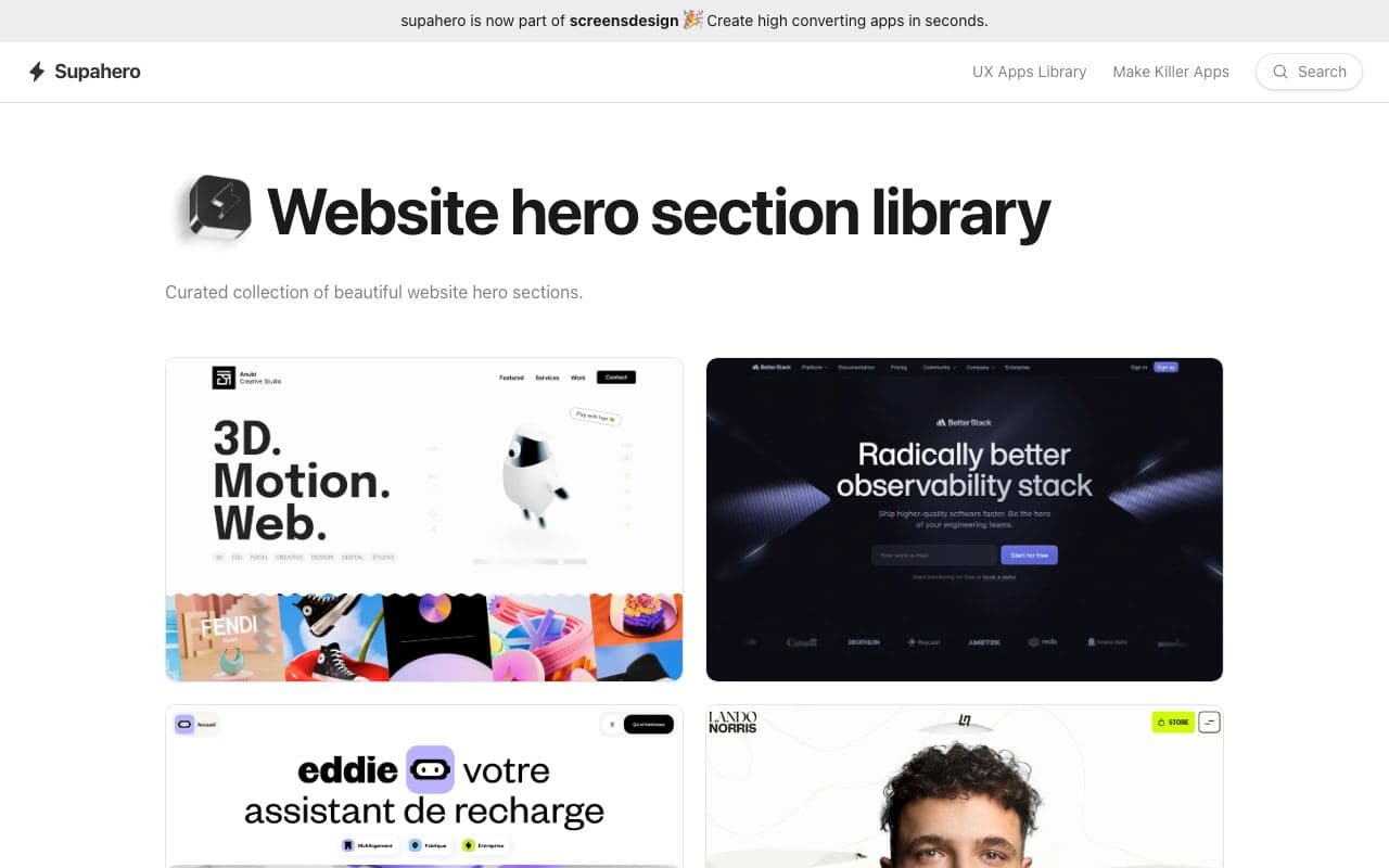
Supahero
Hundreds of heroes side by side. Proof that a hero does not have to be a centred headline with two buttons.
Look at: left-aligned layouts, single calls to action, image placement
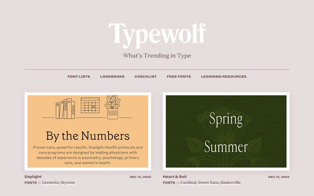
Typewolf
Typefaces shown on real sites, with pairings. Where the Fraunces and Manrope choice comes from.
Look at: serif display over sans body, sizing contrast between headline and lead
The contract
A DESIGN.md on Google’s open format: tokens in the front matter, the reasoning in prose. Your agent reads the whole thing; you can read the summary.
Colours
- paper#f7f4ee
- surface#fffdf9
- ink#1a1815
- ink-2#4a4640
- ink-3#7a756c
- line#e6e1d7
- line-strong#cfc8bb
- primary#c2410c
- primary-soft#fbe9df
- on-primary#fffdf9
- ink-inverse#f7f4ee
- surface-inverse#1a1815
Type
- Frauncesdisplay 72px/500 · headline 40px/500
- Manropelead 20px/400 · body 17px/400 · label 13px/600 · caption 14px/400
Spacing
- base
- 8px
- xs
- 8px
- sm
- 16px
- md
- 24px
- lg
- 40px
- xl
- 64px
- 2xl
- 96px
- 3xl
- 144px
- gutter
- 32px
- measure
- 640px
- container
- 1200px
Radii
- none
- 0px
- sm
- 2px
- md
- 4px
- full
- 9999px
Read the whole file169 lines
---
version: alpha
name: Editorial Landing Page
description: A marketing page that reads like a well-set magazine. Type does the work; one warm accent does the pointing.
colors:
  paper: "#f7f4ee"
  surface: "#fffdf9"
  ink: "#1a1815"
  ink-2: "#4a4640"
  ink-3: "#7a756c"
  line: "#e6e1d7"
  line-strong: "#cfc8bb"
  primary: "#c2410c"
  primary-soft: "#fbe9df"
  on-primary: "#fffdf9"
  ink-inverse: "#f7f4ee"
  surface-inverse: "#1a1815"
typography:
  display:
    fontFamily: Fraunces
    fontSize: 72px
    fontWeight: 500
    lineHeight: 1.0
    letterSpacing: -0.02em
    fontVariation: "'opsz' 144, 'SOFT' 30"
  headline:
    fontFamily: Fraunces
    fontSize: 40px
    fontWeight: 500
    lineHeight: 1.1
    letterSpacing: -0.015em
  lead:
    fontFamily: Manrope
    fontSize: 20px
    fontWeight: 400
    lineHeight: 1.55
  body:
    fontFamily: Manrope
    fontSize: 17px
    fontWeight: 400
    lineHeight: 1.65
  label:
    fontFamily: Manrope
    fontSize: 13px
    fontWeight: 600
    lineHeight: 1.3
    letterSpacing: 0.08em
  caption:
    fontFamily: Manrope
    fontSize: 14px
    fontWeight: 400
    lineHeight: 1.5
rounded:
  none: 0px
  sm: 2px
  md: 4px
  full: 9999px
spacing:
  base: 8px
  xs: 8px
  sm: 16px
  md: 24px
  lg: 40px
  xl: 64px
  2xl: 96px
  3xl: 144px
  gutter: 32px
  measure: 640px
  container: 1200px
components:
  button-primary:
    backgroundColor: "{colors.ink}"
    textColor: "{colors.ink-inverse}"
    typography: "{typography.label}"
    rounded: "{rounded.md}"
    padding: "{spacing.sm}"
    height: 48px
  button-secondary:
    backgroundColor: "{colors.paper}"
    textColor: "{colors.ink}"
    typography: "{typography.label}"
    rounded: "{rounded.md}"
    padding: "{spacing.sm}"
    height: 48px
  eyebrow:
    textColor: "{colors.primary}"
    typography: "{typography.label}"
  section:
    backgroundColor: "{colors.paper}"
    padding: "{spacing.2xl}"
  section-inverse:
    backgroundColor: "{colors.surface-inverse}"
    textColor: "{colors.ink-inverse}"
    padding: "{spacing.2xl}"
  card:
    backgroundColor: "{colors.surface}"
    textColor: "{colors.ink}"
    rounded: "{rounded.md}"
    padding: "{spacing.md}"
  pull-quote:
    textColor: "{colors.ink}"
    typography: "{typography.headline}"
---

# Editorial Landing Page

## Overview

A landing page that trusts its words. Instead of a centred headline, a gradient blob and three feature cards, it borrows from print: a large serif headline set with real optical sizing, generous margins, one warm accent, and images that sit in the grid rather than float over it. The page should feel considered and slightly slow, like something worth reading.

The audience is anyone whose product is better explained than demoed: tools for thinking, services, publications, small serious software.

## Colors

Warm neutrals and one accent. The warmth is the identity; a cool grey page would be a different product.

- **Paper (#f7f4ee):** the page. Off-white with a touch of cream. Surface (#fffdf9) is one step lighter for cards and inputs.
- **Ink (#1a1815), Ink 2 (#4a4640), Ink 3 (#7a756c):** headings, body, captions. Warm blacks, never pure #000.
- **Line (#e6e1d7):** hairlines and dividers. Line strong for input borders.
- **Primary (#c2410c):** burnt orange. Eyebrows, links, the underline on hover, one highlighted word in a headline at most. It is not a button colour; buttons are ink.
- **Inverse pair:** one section per page may flip to ink background with paper text for contrast. Never two in a row.

## Typography

The typeface is the design. Two families, both free on Fontsource.

- **Fraunces** for display and headlines. Use the variable axes: high optical size for the hero, a little softness. Weight 500, not bold; the size does the shouting.
- **Manrope** for everything else. Lead paragraphs at 20px, body at 17px with a long line height, labels at 13px semibold in uppercase with wide tracking.
- Headline measure is short: no more than 12 words, wrapping at around 20 characters per line on desktop. Body measure caps at 640px.
- Never centre body text. Centre a headline only in the hero, and even then prefer left-aligned with a wide left margin.

## Layout

A 1200px container with 32px gutters. Vertical rhythm is 8px-based and generous: 96px between sections on desktop, 144px around the hero, 64px on mobile. Sections alternate between a single centred column and a two-column split with text on one side and one image on the other.

Use whitespace as the divider. If you feel the need to add a border between sections, add 32px of space instead.

Image treatment: full-bleed or on the grid, never floating with a shadow. One image per section.

## Elevation & Depth

None. This is a flat page. Depth comes from the type scale, the inverse section and photography. No shadows, no glass, no gradients. A card is surface on paper with a hairline; that is the entire elevation system.

## Shapes

Nearly square. Buttons and images use a 4px radius; tags 2px; only avatars are round. Fully rounded buttons would break the editorial feel.

## Components

- **Hero:** eyebrow in primary, display headline, one lead paragraph, one primary button and one text link. No second button, no badge row, no "as seen in" strip above the fold.
- **Buttons:** 48px tall, ink background with paper text, label typography in uppercase. Secondary is a text-only button with an underline that turns primary on hover.
- **Section header:** eyebrow, headline, optional lead. Left-aligned.
- **Feature list:** a numbered list with a headline and a paragraph each, stacked, not three cards in a row.
- **Pull quote:** headline typography with a hairline above and below, attribution in caption.
- **Logo strip:** SVGL logos in monochrome ink at 60% opacity, one row, no heading longer than "Used by".
- **Pricing:** at most three tiers, one highlighted with a primary eyebrow, plain feature names. Look at real pricing tables before writing one.
- **Footer:** one inverse section with columns of links and a large wordmark.

## Do's and Don'ts

- Do use only Fraunces and Manrope. Fraunces on headlines only; body copy in a serif is a different design.
- Do keep every colour inside the palette. Photography brings its own colour; the interface does not.
- Do keep contrast at WCAG AA: primary orange on paper is fine for labels, not for body text.
- Do respect `prefers-reduced-motion`. Motion here is limited to a fade-up on scroll and a hover underline.
- Don't use gradients, glows, blurred blobs or glassmorphism. If a hero needs texture, use a photograph or a flat shape.
- Don't stack three feature cards with icons. Write the features as a list.
- Don't use more than one accent colour, and never use it as a button fill.
- Don't add a second effect from a component library. One signature moment per page, then calm.
Resources, in order
Chosen for this contract and ordered the way you’ll need them. Each one says whether your agent can install it or only look at it.
Godly Godly
01Astronomically good web design inspiration, hand-picked.
limited agent friendlinessGalleryFreeStaff pickUsed by meSupahero Supahero
02Hundreds of website hero sections from real sites, nothing else.
limited agent friendlinessGalleryFreeNavbar Gallery 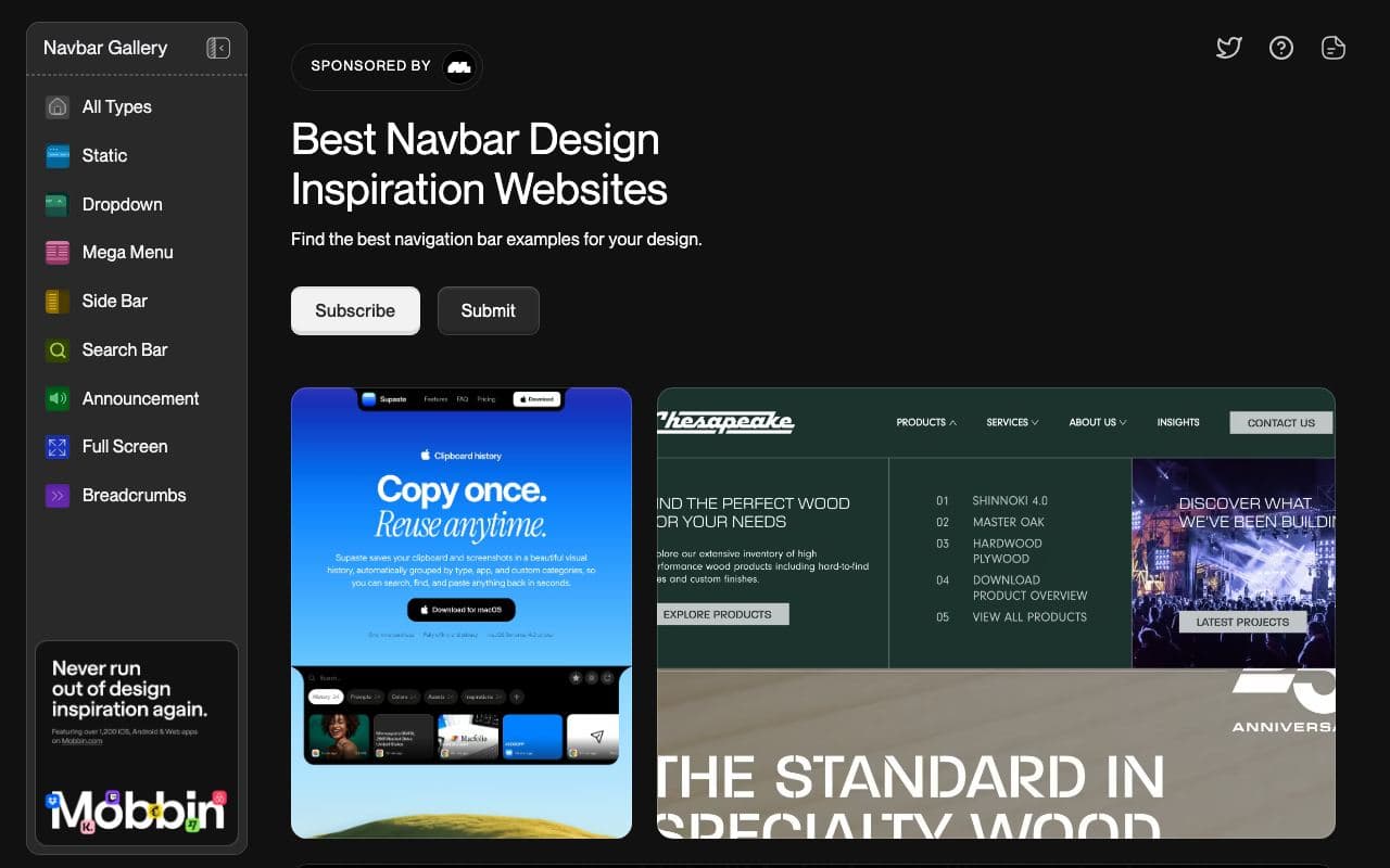
Navbar Gallery
03550+ real website navbars, sorted by type: mega menus, sidebars, tabs and the rest.
limited agent friendlinessGalleryFreeCTA Gallery 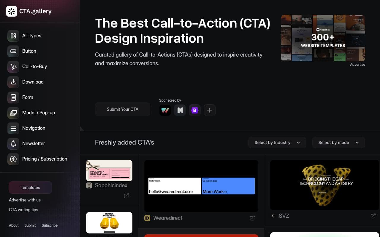
CTA Gallery
04Real calls to action, sorted into buttons, forms, modals, pricing and newsletters.
limited agent friendlinessGalleryFreeTypewolf Typewolf
05What's trending in type, with real sites showing each font in use.
limited agent friendlinessWebsiteStaff pickFontsource 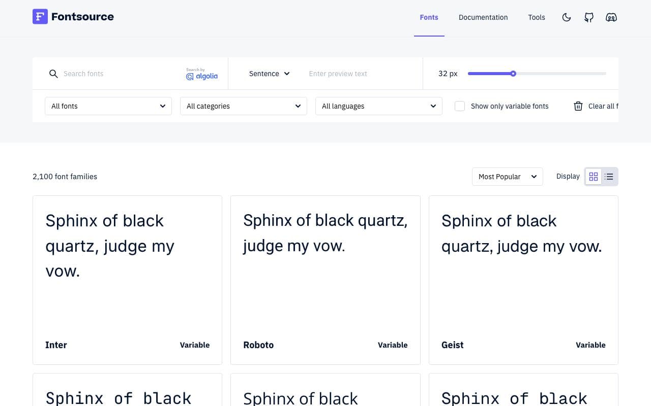
Fontsource
06Self-host any open-source font with an npm install.
excellent agent friendlinessPackageFreeOpen sourceMagic UI 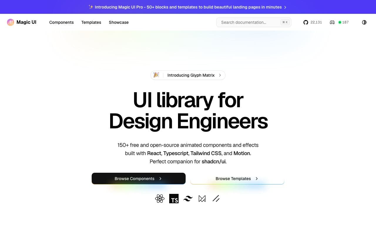
Magic UI
07Animated React components and effects for landing pages, built to sit alongside shadcn/ui.
excellent agent friendlinessComponent libraryOpen sourceSVGL 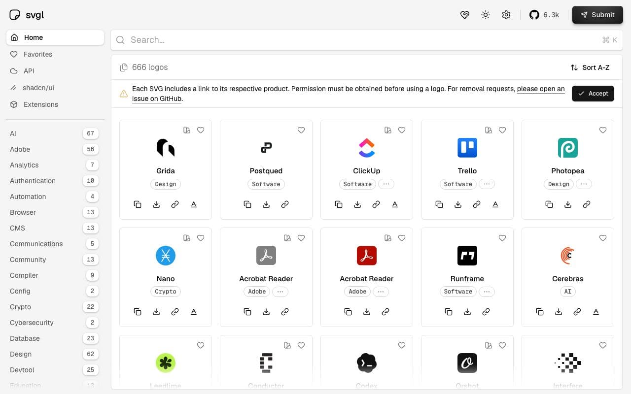
SVGL
08A beautiful library of full-colour SVG logos with light and dark variants.
excellent agent friendlinessAsset libraryFreeOpen sourceWeb Interface Guidelines 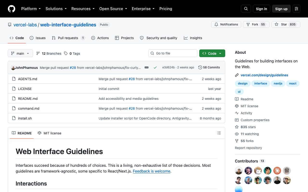
Web Interface Guidelines
09A concise, agent-readable checklist of what a well-built web interface must get right.
excellent agent friendlinessGuideFreeOpen sourceStaff pickUsed by me
What your agent is told
This block goes into AGENTS.md (and CLAUDE.md if you have one). Prefer to paste it yourself? Copy it.
Goes deeper