Component libraryComponents, Motion
Magic UI
Animated React components and effects for landing pages, built to sit alongside shadcn/ui.

What it is
Magic UI is a collection of animated components (marquees, shimmer buttons, animated beams, bento grids, text effects) built with React, Tailwind and Motion. They are installed through the same CLI as shadcn/ui, so they drop into an existing project cleanly. There is a paid tier of full templates.
Why it’s here
The quickest way to make a landing page feel alive. Use two or three effects with restraint; a page made entirely of Magic UI components starts to look like a demo.
Best for
- landing pages
- marketing sites
- hero sections
- product showcases
Can my agent use this?
Agent excellent agent friendlinessYes. Components install via the shadcn CLI and every doc page shows the full source. Name the exact component you want, for example "add the Magic UI Marquee component".
Excellent: Public docs, public source or an installable package. An agent can read, install and implement this directly.
Access methods
- Docs
- GitHub
- CLI
- Copy/paste
Install
npx shadcn@latest add "https://magicui.design/r/marquee"Related resources
Aceternity UI 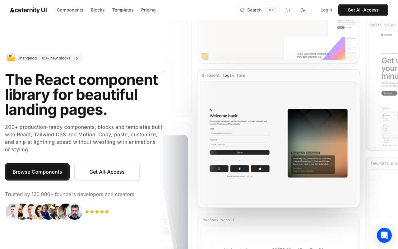
Aceternity UI
Showy, copy-paste React components for landing pages that need a moment.
good agent friendlinessComponent libraryOrigin UI 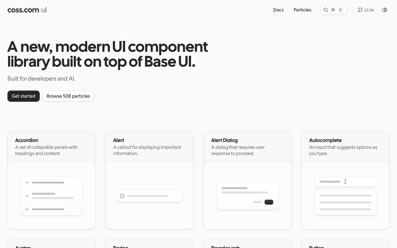
Origin UI
Hundreds of polished, practical components built on shadcn/ui conventions.
excellent agent friendlinessComponent libraryFreeOpen sourceStaff pickTailwind Plus 
Tailwind Plus
The official paid Tailwind component and template catalogue (formerly Tailwind UI).
limited agent friendlinessComponent libraryTremor 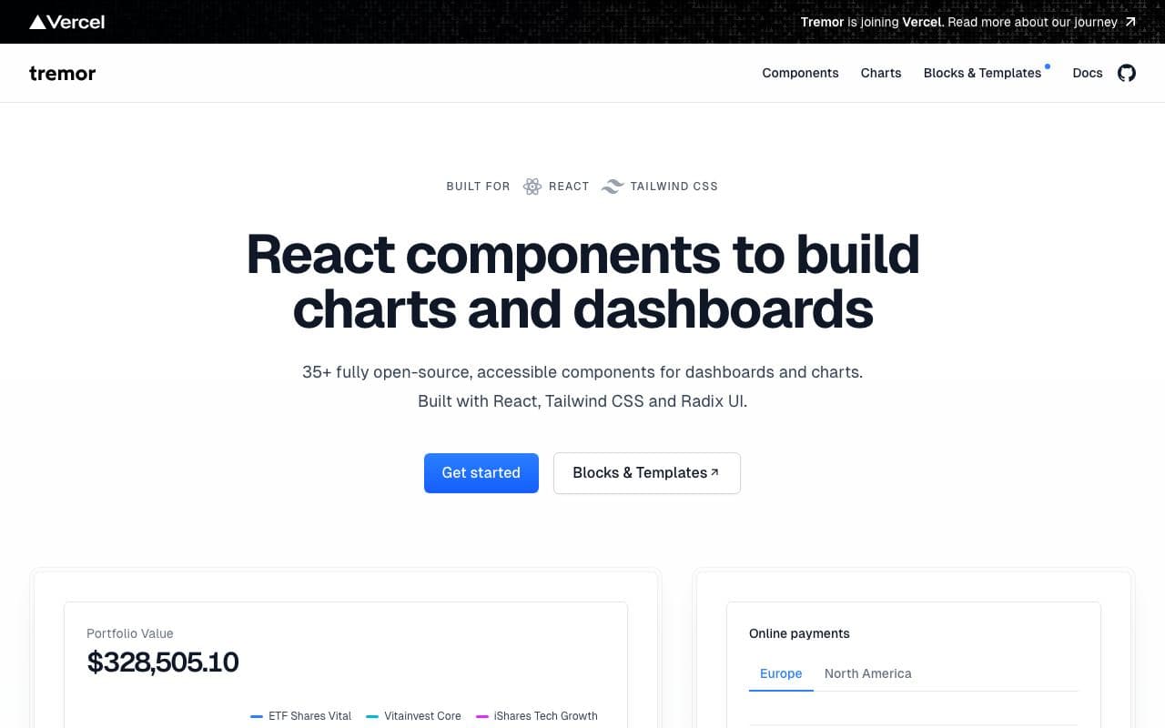
Tremor
Copy-paste React components for dashboards and charts.
excellent agent friendlinessComponent libraryFreeOpen source