Component libraryComponents
Origin UI
Hundreds of polished, practical components built on shadcn/ui conventions.
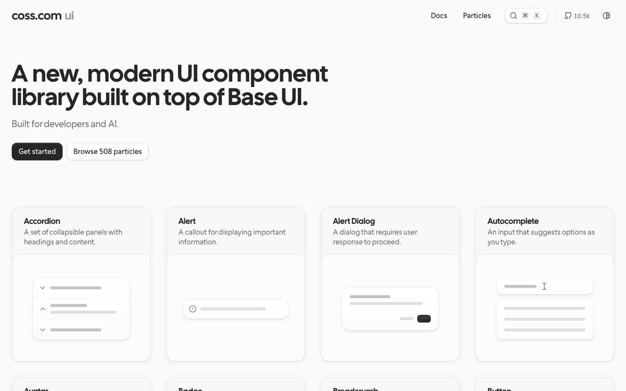
What it is
Origin UI is a large, free collection of components and variants (inputs, selects, tables, dialogs, notifications, sliders, and more) that follow shadcn/ui conventions. Where shadcn gives you one button, Origin gives you thirty well-considered variations to copy.
Why it’s here
Quietly one of the most useful component resources around. Less flashy than Magic UI or Aceternity, far more useful for actual product interfaces.
Best for
- app interfaces
- forms and inputs
- tables
- settings pages
Can my agent use this?
Agent excellent agent friendlinessYes. Every component shows its source and has a registry URL for the shadcn CLI. Give your agent the component's page or registry link.
Excellent: Public docs, public source or an installable package. An agent can read, install and implement this directly.
Access methods
- Public website
- GitHub
- CLI
- Copy/paste
Related resources
tweakcn 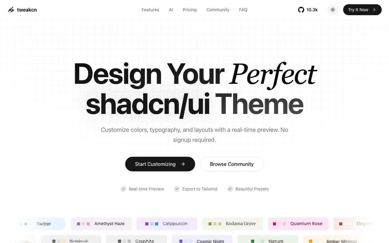
tweakcn
A visual theme editor that makes a shadcn/ui app stop looking like every other shadcn/ui app.
good agent friendlinessToolFreeOpen sourceStaff pickUsed by meMagic UI 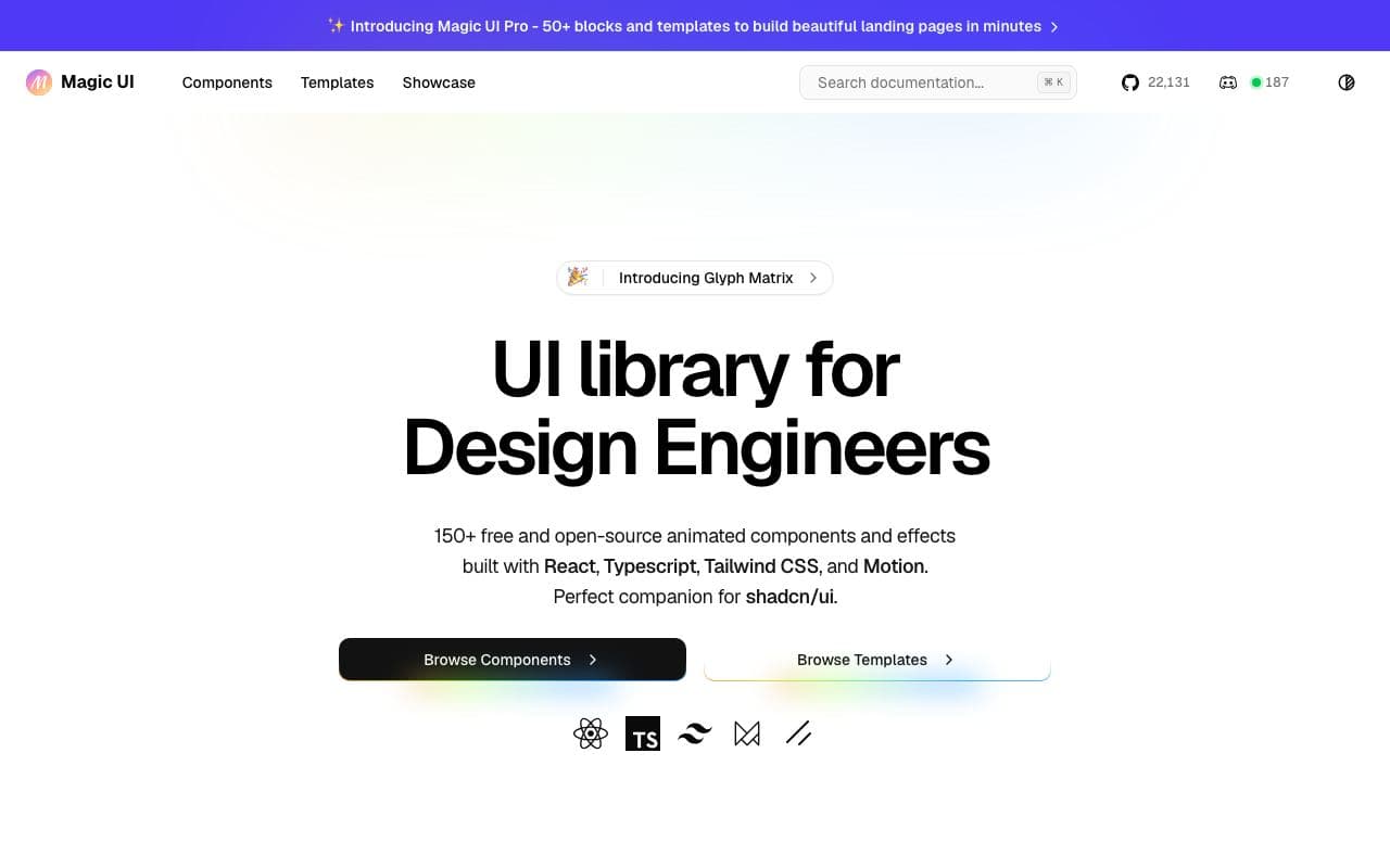
Magic UI
Animated React components and effects for landing pages, built to sit alongside shadcn/ui.
excellent agent friendlinessComponent libraryOpen sourceTremor 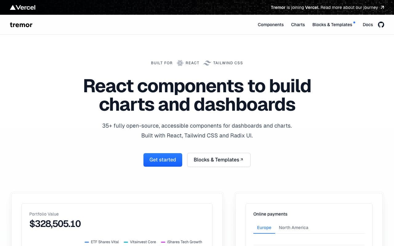
Tremor
Copy-paste React components for dashboards and charts.
excellent agent friendlinessComponent libraryFreeOpen sourceAceternity UI 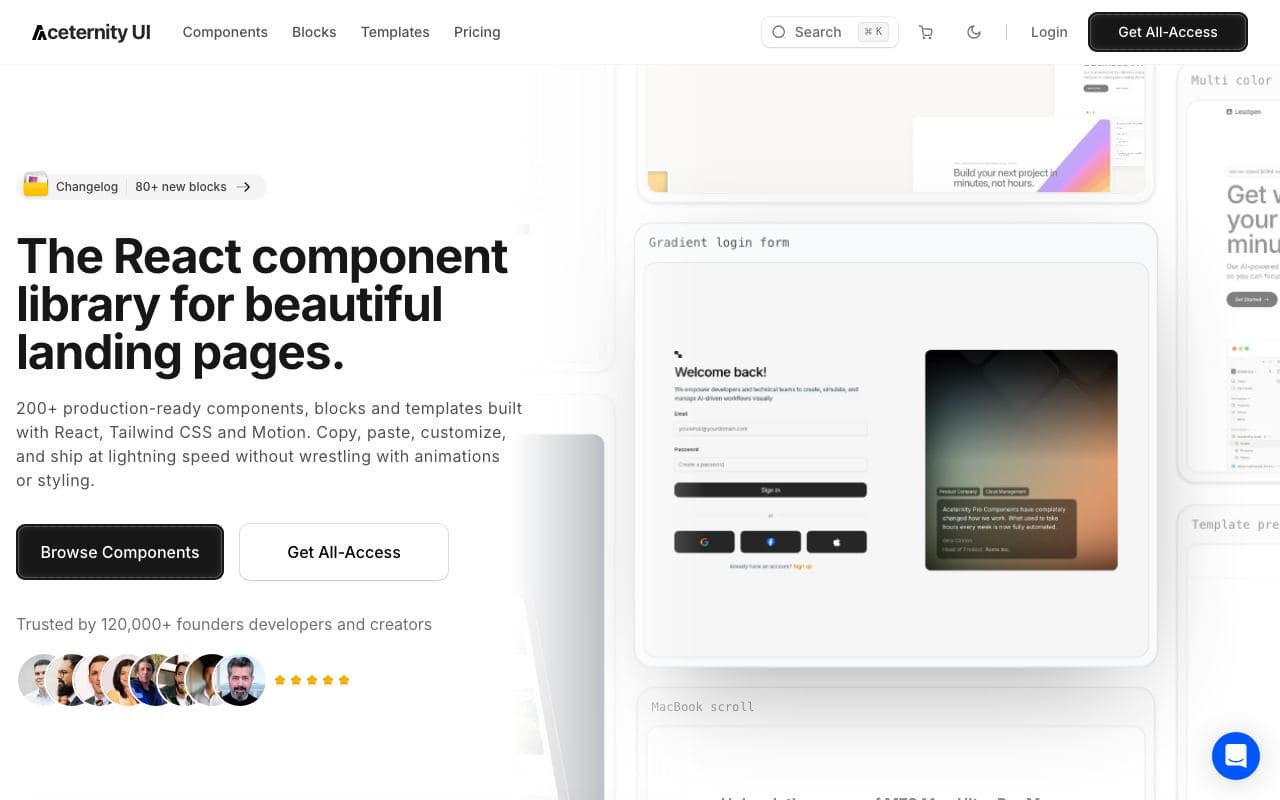
Aceternity UI
Showy, copy-paste React components for landing pages that need a moment.
good agent friendlinessComponent library