Pack No design background needed
First Vibe-Coded App
Defaults that are hard to get wrong, for people who have never built software before.
A contract for your first app: warm off-white pages, one teal, soft corners, one friendly typeface in five sizes. Nothing here needs design knowledge. The agent reads the file, uses only what is in it, and runs a check that tells it what to fix in plain language.
Install the pack before you ask for a single screen. Then build with v0 or your agent, use tweakcn if you are on shadcn, and paste a Checklist Design list into your prompt so the empty state and the focus ring don't get forgotten. Auto Animate is the one motion library you need. When something looks off, run the check and hand the report to the agent.
- Type
- DM Sans + DM Mono
- Colours
- 15 tokens
- Stack
- React, Next.js, Tailwind CSS
- Checks
- /
For agents: this pack as markdown · install manifest
Reference screens
Look at these before you write a prompt, so you’re describing something real. Take the principle, not the pixels.
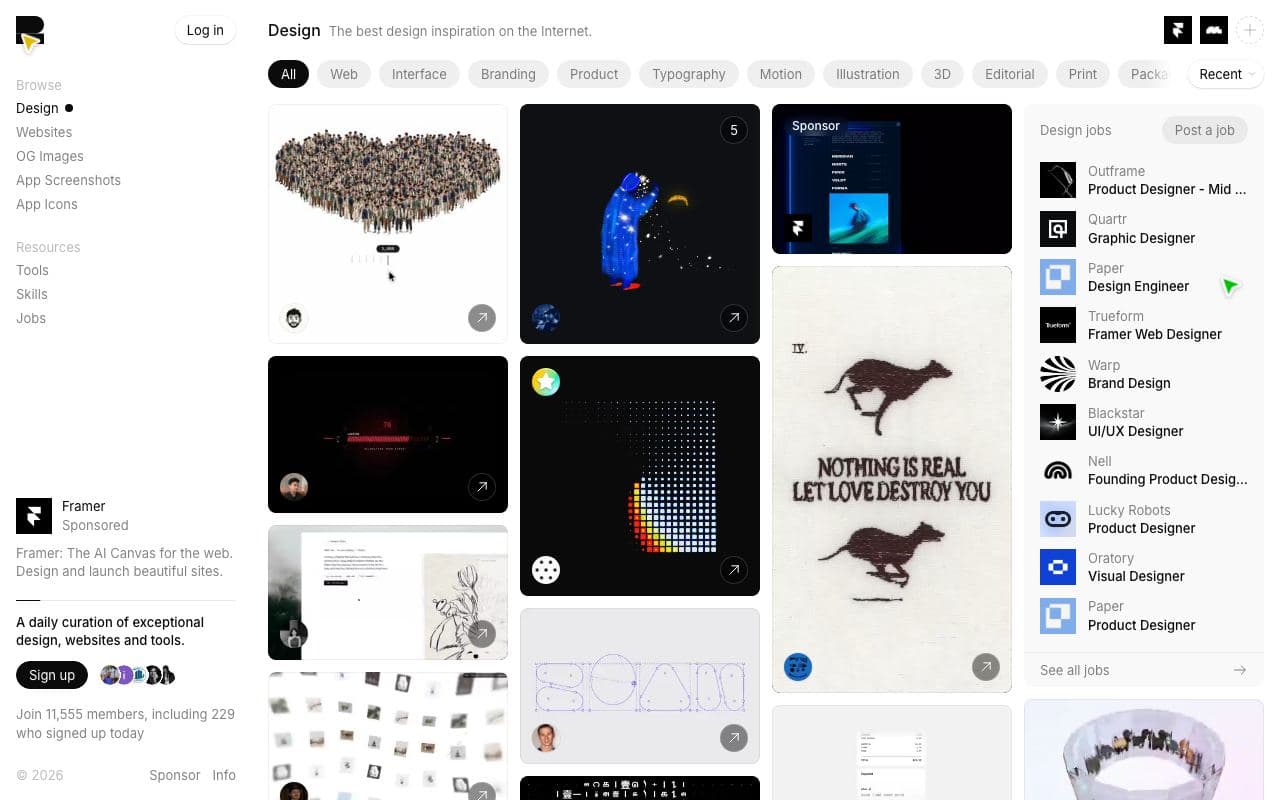
Godly
What good looks like. You don't need to copy any of it; you need to have seen it before you describe what you want.
Look at: how much empty space there is, how few colours each site uses
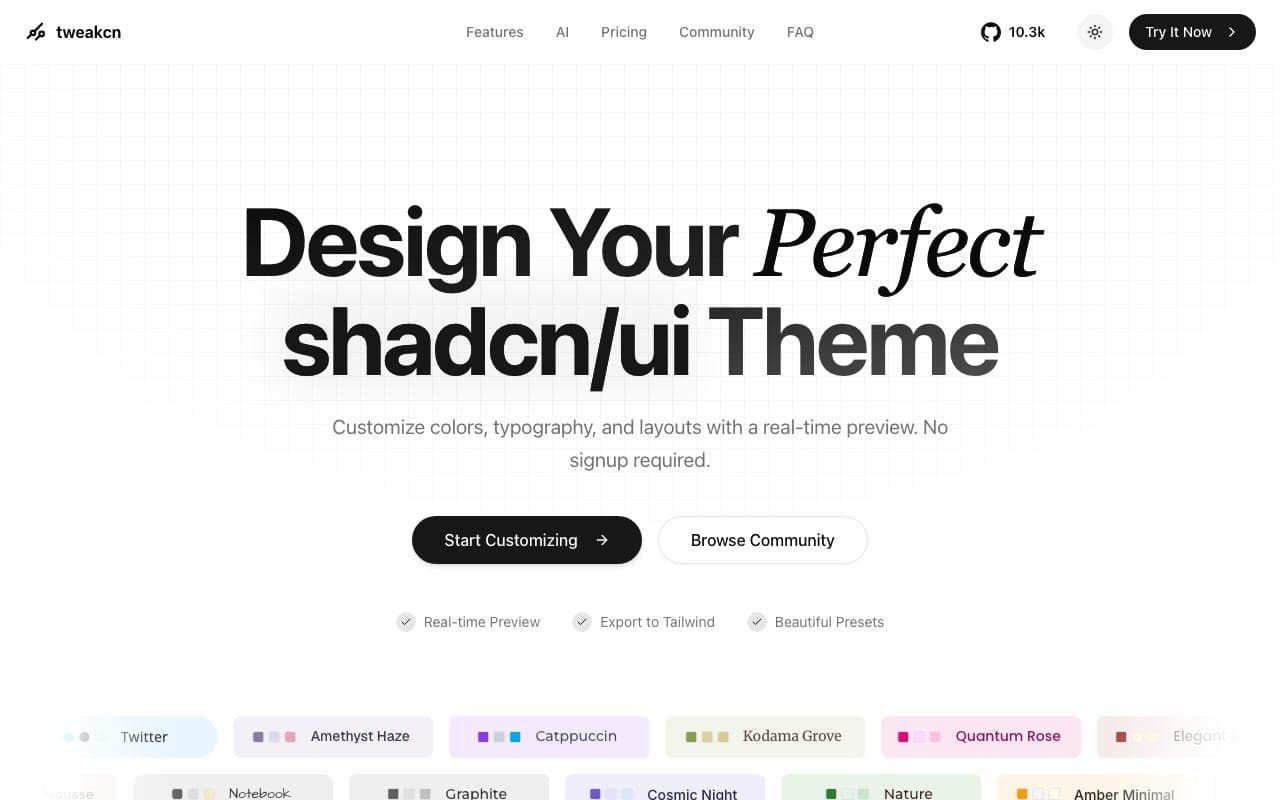
tweakcn
A theme editor for shadcn apps. Ten minutes here does more than an afternoon of prompting.
Look at: how one radius and one accent change the whole feel
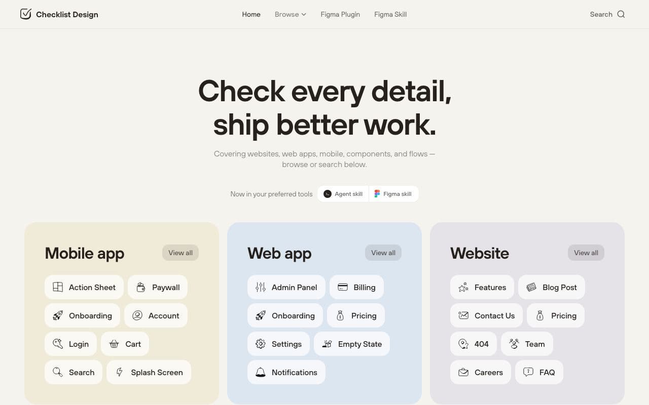
Checklist Design
What every screen should include. Paste a checklist into your prompt so the agent stops forgetting things.
Look at: the form and empty-state checklists
The contract
A DESIGN.md on Google’s open format: tokens in the front matter, the reasoning in prose. Your agent reads the whole thing; you can read the summary.
Colours
- paper#f8f7f4
- surface#ffffff
- surface-2#efede8
- ink#17181a
- ink-2#55575c
- ink-3#7d8087
- line#e3e1dc
- line-strong#c9c6bf
- primary#0f766e
- primary-soft#e6f4f2
- on-primary#ffffff
- success#15803d
- success-soft#ecfdf3
- error#b42318
- error-soft#fef3f2
Type
- DM Sanstitle 32px/600 · heading 20px/600 · body 16px/400 · small 14px/400 · label 14px/500
- DM Monomono 14px/400
Spacing
- base
- 4px
- xs
- 4px
- sm
- 8px
- md
- 16px
- lg
- 24px
- xl
- 32px
- 2xl
- 48px
- 3xl
- 64px
- gutter
- 16px
- measure
- 640px
Radii
- sm
- 6px
- md
- 8px
- lg
- 12px
- full
- 9999px
Read the whole file170 lines
---
version: alpha
name: First Vibe-Coded App
description: Safe, good-looking defaults for someone building their first app with an agent. Nothing here needs a design vocabulary.
colors:
  paper: "#f8f7f4"
  surface: "#ffffff"
  surface-2: "#efede8"
  ink: "#17181a"
  ink-2: "#55575c"
  ink-3: "#7d8087"
  line: "#e3e1dc"
  line-strong: "#c9c6bf"
  primary: "#0f766e"
  primary-soft: "#e6f4f2"
  on-primary: "#ffffff"
  success: "#15803d"
  success-soft: "#ecfdf3"
  error: "#b42318"
  error-soft: "#fef3f2"
typography:
  title:
    fontFamily: DM Sans
    fontSize: 32px
    fontWeight: 600
    lineHeight: 1.15
    letterSpacing: -0.02em
  heading:
    fontFamily: DM Sans
    fontSize: 20px
    fontWeight: 600
    lineHeight: 1.3
  body:
    fontFamily: DM Sans
    fontSize: 16px
    fontWeight: 400
    lineHeight: 1.6
  small:
    fontFamily: DM Sans
    fontSize: 14px
    fontWeight: 400
    lineHeight: 1.5
  label:
    fontFamily: DM Sans
    fontSize: 14px
    fontWeight: 500
    lineHeight: 1.4
  mono:
    fontFamily: DM Mono
    fontSize: 14px
    fontWeight: 400
    lineHeight: 1.5
rounded:
  sm: 6px
  md: 8px
  lg: 12px
  full: 9999px
spacing:
  base: 4px
  xs: 4px
  sm: 8px
  md: 16px
  lg: 24px
  xl: 32px
  2xl: 48px
  3xl: 64px
  gutter: 16px
  measure: 640px
components:
  button-primary:
    backgroundColor: "{colors.primary}"
    textColor: "{colors.on-primary}"
    typography: "{typography.label}"
    rounded: "{rounded.md}"
    padding: "{spacing.md}"
    height: 40px
  button-secondary:
    backgroundColor: "{colors.surface}"
    textColor: "{colors.ink}"
    typography: "{typography.label}"
    rounded: "{rounded.md}"
    padding: "{spacing.md}"
    height: 40px
  card:
    backgroundColor: "{colors.surface}"
    textColor: "{colors.ink}"
    rounded: "{rounded.lg}"
    padding: "{spacing.lg}"
  input:
    backgroundColor: "{colors.surface}"
    textColor: "{colors.ink}"
    typography: "{typography.body}"
    rounded: "{rounded.md}"
    padding: "{spacing.sm}"
    height: 40px
  badge:
    backgroundColor: "{colors.primary-soft}"
    textColor: "{colors.primary}"
    typography: "{typography.small}"
    rounded: "{rounded.full}"
    padding: "{spacing.xs}"
  list-item:
    backgroundColor: "{colors.surface}"
    textColor: "{colors.ink}"
    padding: "{spacing.md}"
    rounded: "{rounded.md}"
---

# First Vibe-Coded App

## Overview

You are building something for the first time and you do not want it to look like a demo. This contract gives you a look that is hard to get wrong: warm off-white pages, dark grey text, one teal for buttons and links, soft corners, a friendly typeface. It is deliberately plain. Plain and consistent beats interesting and messy every time.

Everything in this file is a default. Change a value only when you have a reason you can say out loud.

## Colors

Five greys, one colour, two statuses. Learn what each is for and you will never need to pick a colour again.

- **Paper (#f8f7f4):** the page background. Not pure white, so white cards stand out a little.
- **Surface (#ffffff):** cards, forms, dialogs. Surface 2 (#efede8) is for things that sit back, like a sidebar or a disabled state.
- **Ink (#17181a):** headings and body text. Ink 2 for less important text. Ink 3 for hints and placeholders. Never lighter than ink 3 for anything someone has to read.
- **Line (#e3e1dc):** borders. All of them.
- **Primary (#0f766e):** teal. The main button, links, the active tab, the focus ring. One teal thing per screen is ideal; two is fine; a screen that is mostly teal is wrong.
- **Success and Error:** messages after the user does something. Not for decoration.

## Typography

One typeface, DM Sans, in five sizes. A second one, DM Mono, only for code or IDs.

- Page title 32px semibold. Section heading 20px semibold. Body 16px. Small text 14px. Buttons and form labels 14px medium.
- Line height is generous (1.6 on body). Text blocks stop at 640px wide.
- Do not add a third size between these. If something feels like it needs one, change its colour to ink 2 instead.

## Layout

Everything sits on a 4px grid: 8 between related things, 16 inside cards and between form fields, 24 between groups, 48 between sections. Page padding is 16px on mobile and 24px on desktop. The content column is at most 1040px wide and centred.

Put things in a single column until you have a reason for two. Mobile first: if it works at 390px wide, it will work everywhere.

## Elevation & Depth

Flat with one exception. Cards are white on paper with a line border and no shadow. Dialogs and dropdowns get one soft shadow because they float above the page. No gradients, no glow, no glass.

## Shapes

Softly rounded: 6px on badges and small controls, 8px on buttons and inputs, 12px on cards. Pills only for badges and avatars. Keep the same radius on every button.

## Components

- **Buttons:** 40px tall. Primary is teal with white text. Secondary is white with a line border. One primary button per screen.
- **Inputs:** 40px tall, white, line border, teal ring on focus. Label above in label style, help or error text below in small.
- **Cards:** white, line border, 12px radius, 24px padding, a heading and some body text. Not a card inside a card.
- **Lists:** rows with 16px padding and a hairline between them. Use Auto Animate so adding and removing rows feels smooth.
- **Badges:** pill, teal-soft background, teal text, small size.
- **Empty state:** one sentence saying what will appear here and one button to make it appear.
- **Navigation:** a top bar with the app name on the left and at most four links. Active link in teal.

## Do's and Don'ts

- Do use only DM Sans and DM Mono. If a font you did not choose shows up, remove it.
- Do use only the colours in this file. When you want a new one, use ink 2 or surface 2 instead.
- Do keep text readable: 4.5:1 contrast, 16px body, never grey-on-grey.
- Do respect `prefers-reduced-motion`: animations turn off when the user asks.
- Don't use gradients, purple, glow effects or glass. These are the tells of a generated app.
- Don't centre everything. Left-align text and let the layout breathe.
- Don't add icons to every button and heading. Icons go where they carry meaning.
- Don't ask the agent to "make it pop". Ask it to check this file.
Resources, in order
Chosen for this contract and ordered the way you’ll need them. Each one says whether your agent can install it or only look at it.
Godly Godly
01Astronomically good web design inspiration, hand-picked.
limited agent friendlinessGalleryFreeStaff pickUsed by metweakcn tweakcn
02A visual theme editor that makes a shadcn/ui app stop looking like every other shadcn/ui app.
good agent friendlinessToolFreeOpen sourceStaff pickUsed by meChecklist Design Checklist Design
03Checklists of what every common screen and component should include.
good agent friendlinessGuideFreeStaff pickAutoAnimate 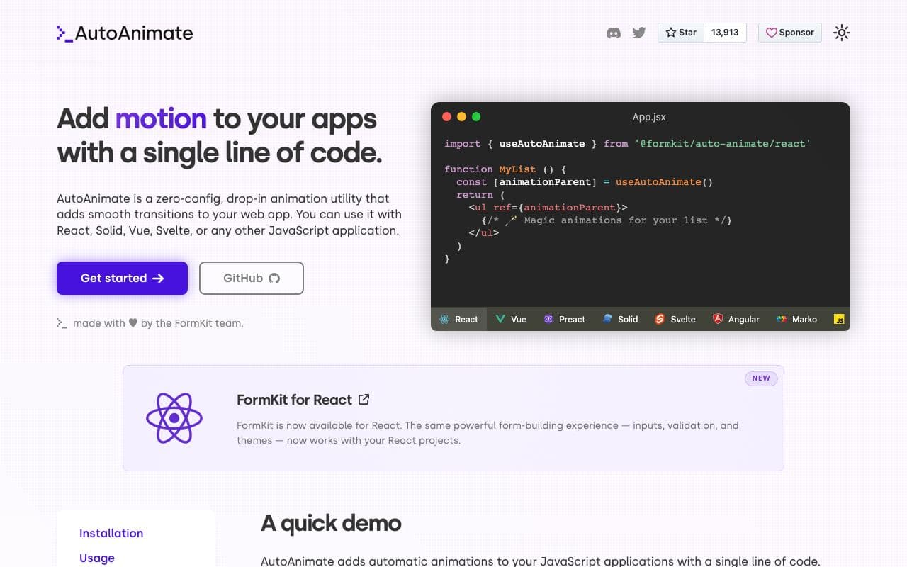
AutoAnimate
04One line of code that animates list changes for you.
excellent agent friendlinessPackageFreeOpen sourceStaff pickv0 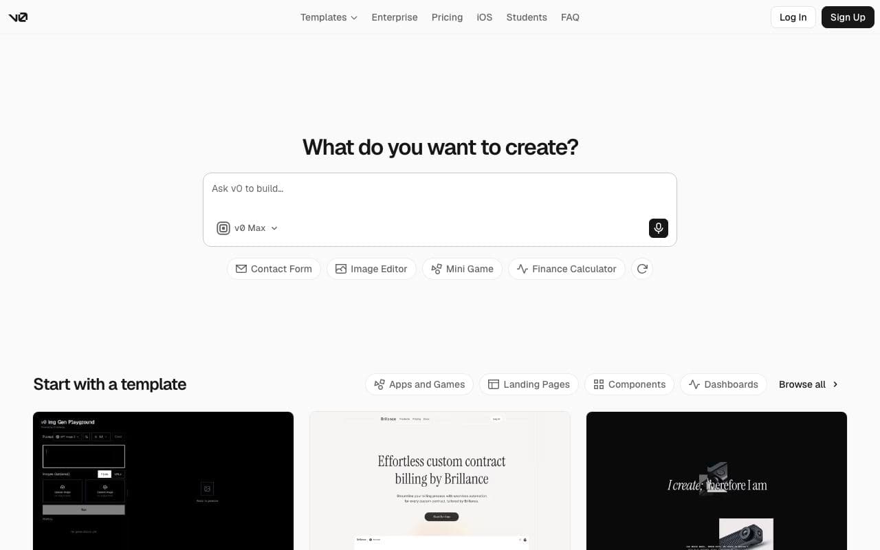
v0
05Vercel's generative UI tool: describe a screen, get a shadcn/ui implementation.
good agent friendlinessToolRadix Colors 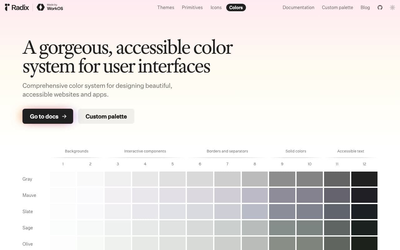
Radix Colors
06Colour scales designed for real UI, with light and dark modes that actually match.
excellent agent friendlinessAsset libraryFreeOpen sourceStaff pickWeb Interface Guidelines 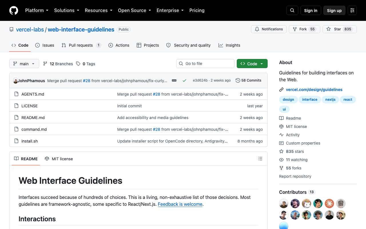
Web Interface Guidelines
07A concise, agent-readable checklist of what a well-built web interface must get right.
excellent agent friendlinessGuideFreeOpen sourceStaff pickUsed by mePlaywright MCP 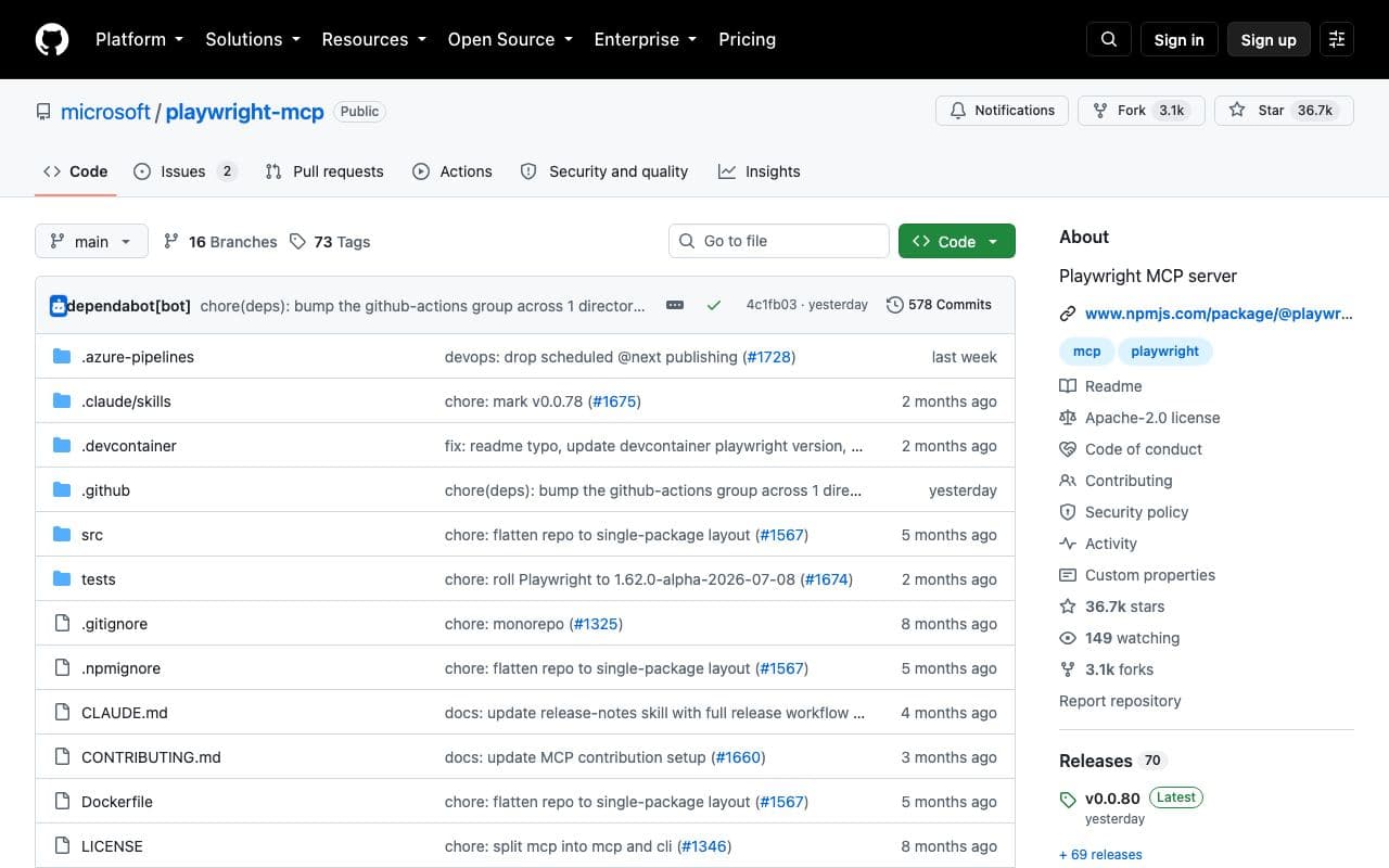
Playwright MCP
08Give your agent a browser so it can see and test what it built.
excellent agent friendlinessMCP serverFreeOpen sourceStaff pickUsed by me
What your agent is told
This block goes into AGENTS.md (and CLAUDE.md if you have one). Prefer to paste it yourself? Copy it.
Goes deeper