Pack For people who ship
Less Generic shadcn
Keep the components, lose the look. A theme, a typeface and a radius, in that order.
A contract for shadcn/ui projects that keeps the component library and replaces the three things that make it recognisable: the zinc greys become warm stone, the black button becomes amber, the 0.5rem radius becomes 0.25rem, and Inter is swapped for Bricolage Grotesque and Figtree. The token names match shadcn's CSS variables so the whole app changes at once.
Install the pack, paste the colours into globals.css and load the fonts. Then use tweakcn to preview and adjust, Radix Colors for a matching dark mode, and Origin UI for the components shadcn doesn't ship. The check will tell you if Inter or a zinc grey is still leaking through.
- Type
- Bricolage Grotesque + Figtree + Geist Mono
- Colours
- 21 tokens
- Stack
- React, Next.js, Tailwind CSS
- Checks
- /
For agents: this pack as markdown · install manifest
Reference screens
Look at these before you write a prompt, so you’re describing something real. Take the principle, not the pixels.
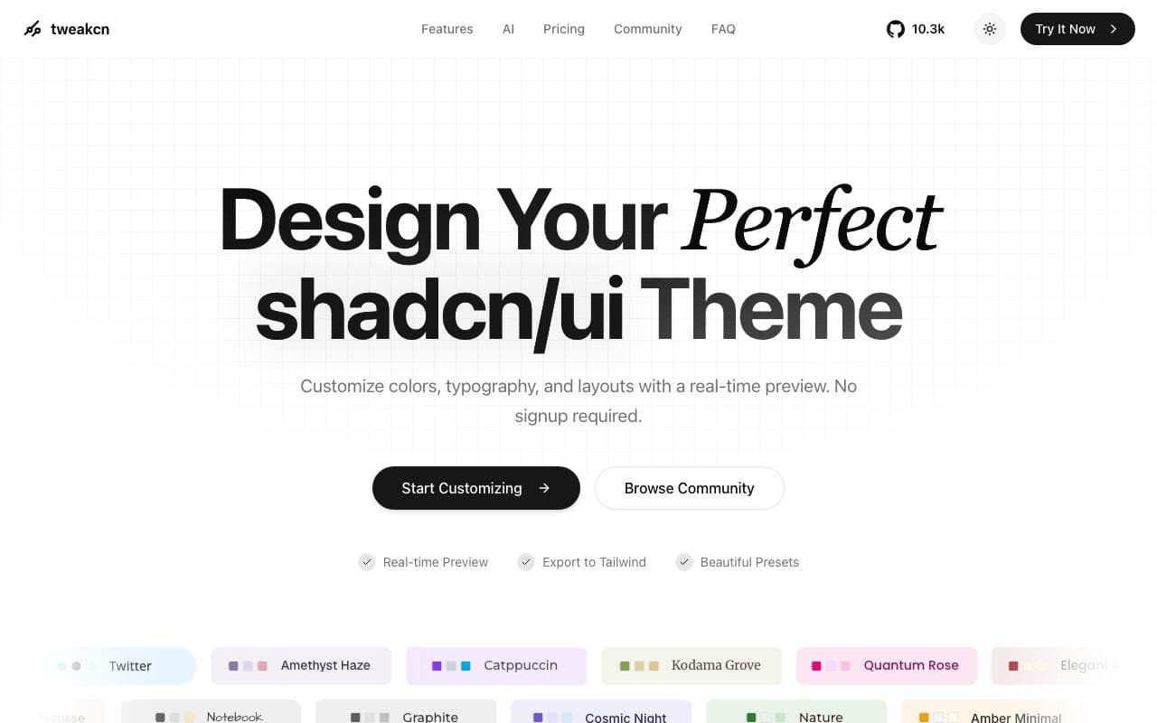
tweakcn
A live shadcn theme editor. See what this pack's tokens do to every component before you commit.
Look at: how radius and one accent change the feel of the same components
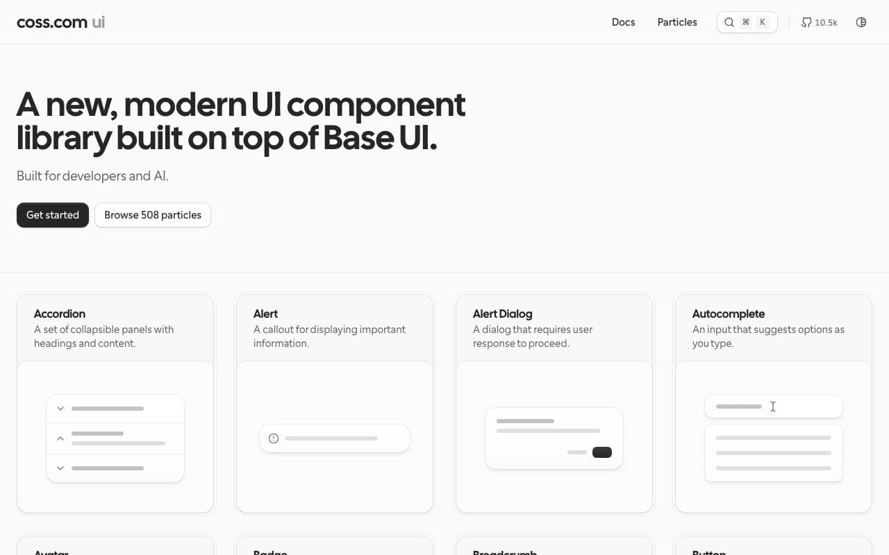
Origin UI
Hundreds of components on shadcn conventions that don't look like the docs. What the finished app should feel like.
Look at: warm neutrals, restrained borders, table and form density
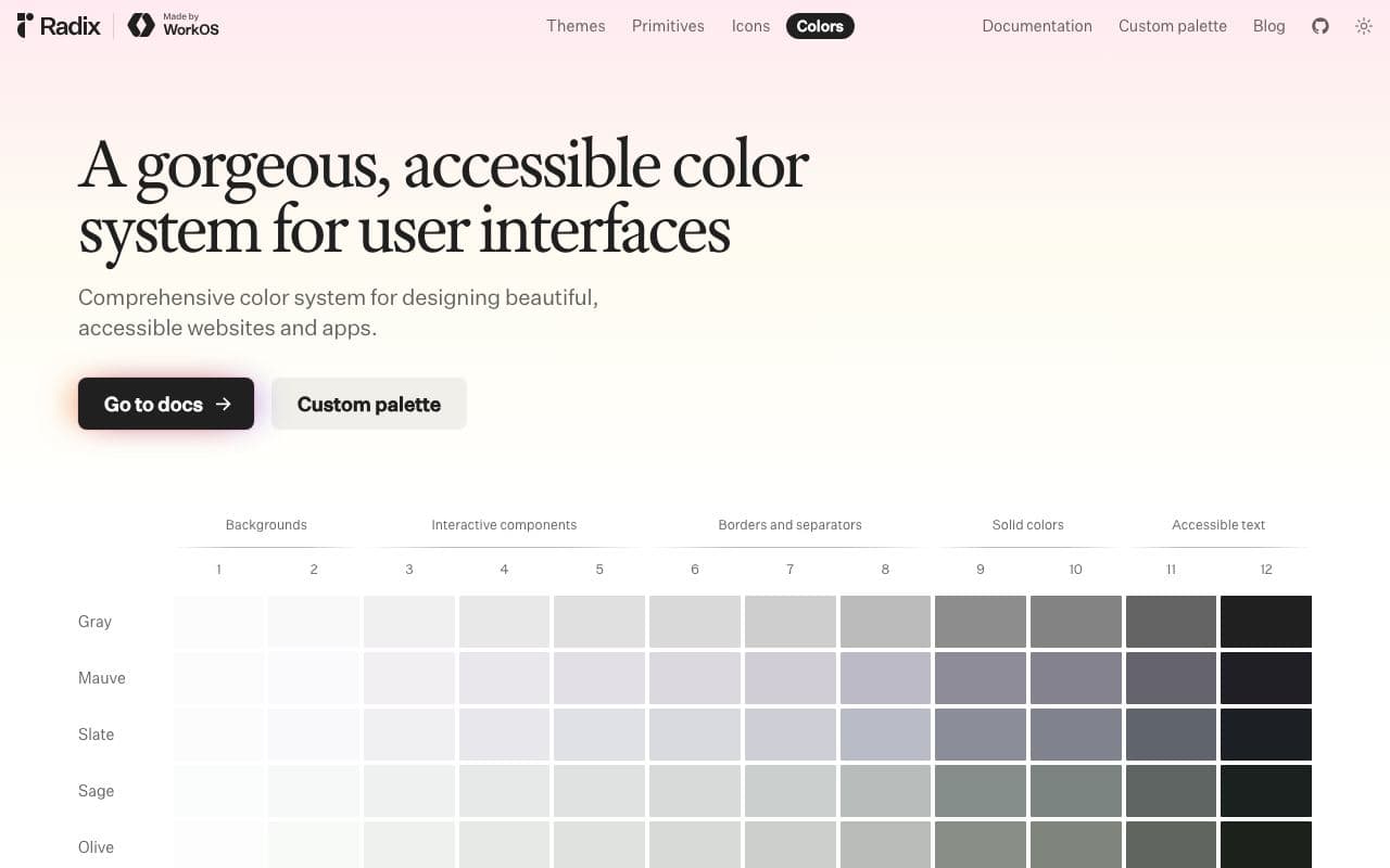
Radix Colors
The colour scales behind good light and dark themes. Where the stone and amber steps come from.
Look at: step 9 for solid colour, step 11 for text, matching dark scales
The contract
A DESIGN.md on Google’s open format: tokens in the front matter, the reasoning in prose. Your agent reads the whole thing; you can read the summary.
Colours
- background#faf9f7
- foreground#1c1917
- card#ffffff
- card-foreground#1c1917
- muted#f0eee9
- muted-foreground#6b665e
- border#e4e0d8
- input#d3cec4
- ring#b45309
- primary#b45309
- primary-foreground#fffbeb
- secondary#f0eee9
- secondary-foreground#1c1917
- accent#fdf3e1
- accent-foreground#7c3a06
- destructive#b91c1c
- destructive-foreground#fef2f2
- chart-1#b45309
- chart-2#1c1917
- chart-3#9c958a
- chart-4#d3cec4
Type
- Bricolage Grotesquedisplay 40px/600 · heading 22px/600
- Figtreebody 15px/400 · small 13px/400 · label 14px/500
- Geist Monomono 13px/400
Spacing
- base
- 4px
- xs
- 4px
- sm
- 8px
- md
- 12px
- lg
- 16px
- xl
- 24px
- 2xl
- 32px
- 3xl
- 48px
- gutter
- 24px
Radii
- sm
- 2px
- md
- 4px
- lg
- 6px
- xl
- 10px
- full
- 9999px
Read the whole file195 lines
---
version: alpha
name: Less Generic shadcn
description: A theme that un-defaults shadcn/ui. Warm stone neutrals, an amber accent, two typefaces that are not Inter, and a radius nobody else uses.
colors:
  background: "#faf9f7"
  foreground: "#1c1917"
  card: "#ffffff"
  card-foreground: "#1c1917"
  muted: "#f0eee9"
  muted-foreground: "#6b665e"
  border: "#e4e0d8"
  input: "#d3cec4"
  ring: "#b45309"
  primary: "#b45309"
  primary-foreground: "#fffbeb"
  secondary: "#f0eee9"
  secondary-foreground: "#1c1917"
  accent: "#fdf3e1"
  accent-foreground: "#7c3a06"
  destructive: "#b91c1c"
  destructive-foreground: "#fef2f2"
  chart-1: "#b45309"
  chart-2: "#1c1917"
  chart-3: "#9c958a"
  chart-4: "#d3cec4"
typography:
  display:
    fontFamily: Bricolage Grotesque
    fontSize: 40px
    fontWeight: 600
    lineHeight: 1.05
    letterSpacing: -0.025em
    fontVariation: "'opsz' 96, 'wdth' 100"
  heading:
    fontFamily: Bricolage Grotesque
    fontSize: 22px
    fontWeight: 600
    lineHeight: 1.25
    letterSpacing: -0.015em
  body:
    fontFamily: Figtree
    fontSize: 15px
    fontWeight: 400
    lineHeight: 1.55
  small:
    fontFamily: Figtree
    fontSize: 13px
    fontWeight: 400
    lineHeight: 1.5
  label:
    fontFamily: Figtree
    fontSize: 14px
    fontWeight: 500
    lineHeight: 1.4
  mono:
    fontFamily: Geist Mono
    fontSize: 13px
    fontWeight: 400
    lineHeight: 1.5
    fontFeature: "tnum"
rounded:
  sm: 2px
  md: 4px
  lg: 6px
  xl: 10px
  full: 9999px
spacing:
  base: 4px
  xs: 4px
  sm: 8px
  md: 12px
  lg: 16px
  xl: 24px
  2xl: 32px
  3xl: 48px
  gutter: 24px
components:
  button-primary:
    backgroundColor: "{colors.primary}"
    textColor: "{colors.primary-foreground}"
    typography: "{typography.label}"
    rounded: "{rounded.md}"
    padding: "{spacing.lg}"
    height: 36px
  button-secondary:
    backgroundColor: "{colors.secondary}"
    textColor: "{colors.secondary-foreground}"
    typography: "{typography.label}"
    rounded: "{rounded.md}"
    padding: "{spacing.lg}"
    height: 36px
  button-outline:
    backgroundColor: "{colors.card}"
    textColor: "{colors.foreground}"
    typography: "{typography.label}"
    rounded: "{rounded.md}"
    padding: "{spacing.lg}"
    height: 36px
  card:
    backgroundColor: "{colors.card}"
    textColor: "{colors.card-foreground}"
    rounded: "{rounded.xl}"
    padding: "{spacing.xl}"
  input:
    backgroundColor: "{colors.card}"
    textColor: "{colors.foreground}"
    typography: "{typography.body}"
    rounded: "{rounded.md}"
    padding: "{spacing.md}"
    height: 36px
  badge:
    backgroundColor: "{colors.accent}"
    textColor: "{colors.accent-foreground}"
    typography: "{typography.small}"
    rounded: "{rounded.sm}"
    padding: "{spacing.xs}"
  tabs-trigger:
    backgroundColor: "{colors.muted}"
    textColor: "{colors.muted-foreground}"
    typography: "{typography.label}"
    rounded: "{rounded.md}"
    padding: "{spacing.md}"
  tabs-trigger-active:
    backgroundColor: "{colors.card}"
    textColor: "{colors.foreground}"
---

# Less Generic shadcn

## Overview

shadcn/ui is a great foundation and a terrible finished look, because every agent-built app ships with the same radius, the same zinc greys and the same Inter. This contract keeps the components and changes everything that makes them recognisable: warm stone neutrals instead of cool zinc, an amber accent instead of black-on-white, a squarer 4px radius, and a display face with some character.

The token names match shadcn's CSS variables on purpose. Paste the colours into `globals.css`, set `--radius: 0.25rem`, load the fonts, and the whole component library changes at once.

## Colors

Warm, not cool. Zinc and slate are the tell of a default install; stone is the fix.

- **Background (#faf9f7) and Card (#ffffff):** the page and the panels on it. Warm off-white and white.
- **Foreground (#1c1917):** text. A warm near-black. Muted foreground (#6b665e) for secondary text and placeholders.
- **Muted (#f0eee9) and Secondary:** the same stone tint, used for secondary buttons, table headers and disabled surfaces.
- **Border (#e4e0d8) and Input (#d3cec4):** hairlines and input edges. Input is a step darker so fields read as fields.
- **Primary (#b45309):** amber. The primary button, the focus ring, active states, the first chart series. It replaces shadcn's black primary; black buttons are the other tell.
- **Accent (#fdf3e1) with accent-foreground:** hover backgrounds and badges. Amber-tinted, not grey.
- **Destructive:** red text on a soft red, never a red-filled button by default.

Dark mode: derive it from Radix Colors' sand scale so the warmth survives. Not part of this contract yet.

## Typography

Two faces that are not Inter, plus a mono for numbers.

- **Bricolage Grotesque** for display and headings. Use the optical size axis: large for page titles, standard for card titles. Weight 600, tight tracking.
- **Figtree** for body, labels, buttons and table text at 15px. It is friendlier than Inter without being cute.
- **Geist Mono** with tabular figures for numbers in tables, IDs, code and keyboard hints.
- Load both text faces with `next/font` or Fontsource and set them on `--font-sans` and `--font-heading`. Then remove Inter from the project.

## Layout

shadcn's spacing conventions on a 4px base: 8 inside controls, 12 and 16 inside cards and forms, 24 between groups, 32 and 48 between sections. Container 1200px with 24px gutters. Sidebars 256px.

Reduce the default card padding from 24px to 16px on dense screens. Prefer dividers to nested cards.

## Elevation & Depth

Flat by default. Cards are card-on-background with a border and no shadow (remove `shadow-sm` from the Card component). Popovers, dropdowns and dialogs keep one soft shadow. No gradients and no glow; the amber accent is the only warmth the page needs.

## Shapes

Squarer than the default. `--radius` is 0.25rem: 2px on badges, 4px on buttons and inputs, 6px on tabs and menus, 10px on cards and dialogs. Fully rounded only for avatars and switches. The default 0.5 to 0.625rem radius is one of the strongest "this is shadcn" signals; changing it is the cheapest win in this file.

## Components

- **Button:** 36px tall. Default variant is amber with cream text. Secondary is stone. Outline is card with a border. Ghost has an accent hover. Never a black button.
- **Card:** white, border, 10px radius, 24px padding (16px when dense), no shadow. Title in heading typography.
- **Input and Select:** 36px, input-coloured border, amber ring on focus with a 2px offset. Labels in label typography above.
- **Badge:** 2px radius, accent background, accent-foreground text, small typography. Outline variant uses border.
- **Tabs:** muted background list, card-coloured active trigger, label typography. No underline tabs unless the page is a document.
- **Table:** muted header row with small uppercase-free labels, 40px body rows, numbers right-aligned in mono, borders only between rows.
- **Dialog and Sheet:** 10px radius, one shadow, 24px padding, title in heading typography.
- **Toast:** card background, border, no colour fill; destructive variant uses destructive text.

## Do's and Don'ts

- Do use only Bricolage Grotesque, Figtree and Geist Mono. If Inter is still loading, the theme is not applied.
- Do keep every colour on the shadcn variable names above so components pick them up automatically.
- Do keep contrast at WCAG AA: amber on cream for buttons passes; amber text on white does not below 18px, so use accent-foreground for small amber text.
- Do respect `prefers-reduced-motion` in every Radix animation; the defaults already do if you keep `tailwindcss-animate` behaviour intact.
- Don't ship the zinc palette, the black primary button or the 0.5rem radius. Those three are the entire "generic" look.
- Don't use gradients, glows or glassmorphism anywhere, including the hero of the marketing page.
- Don't add a second accent. Amber is the only colour that means "interactive".
- Don't restyle components one by one. Change the tokens; if a component still looks default, the token is wrong.
Resources, in order
Chosen for this contract and ordered the way you’ll need them. Each one says whether your agent can install it or only look at it.
tweakcn tweakcn
01A visual theme editor that makes a shadcn/ui app stop looking like every other shadcn/ui app.
good agent friendlinessToolFreeOpen sourceStaff pickUsed by meRadix Colors Radix Colors
02Colour scales designed for real UI, with light and dark modes that actually match.
excellent agent friendlinessAsset libraryFreeOpen sourceStaff pickOrigin UI Origin UI
03Hundreds of polished, practical components built on shadcn/ui conventions.
excellent agent friendlinessComponent libraryFreeOpen sourceStaff pickNumberFlow 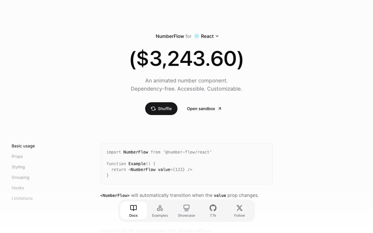
NumberFlow
04Animated number transitions that make counters, prices and stats feel expensive.
excellent agent friendlinessPackageFreeOpen sourceshadcn MCP server 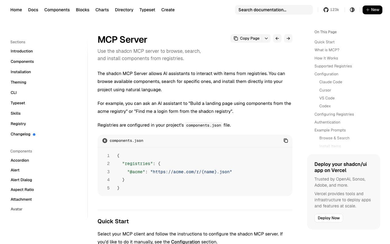
shadcn MCP server
05Let your agent browse, search and install components from any shadcn registry.
excellent agent friendlinessMCP serverFreeOpen sourceTypewolf 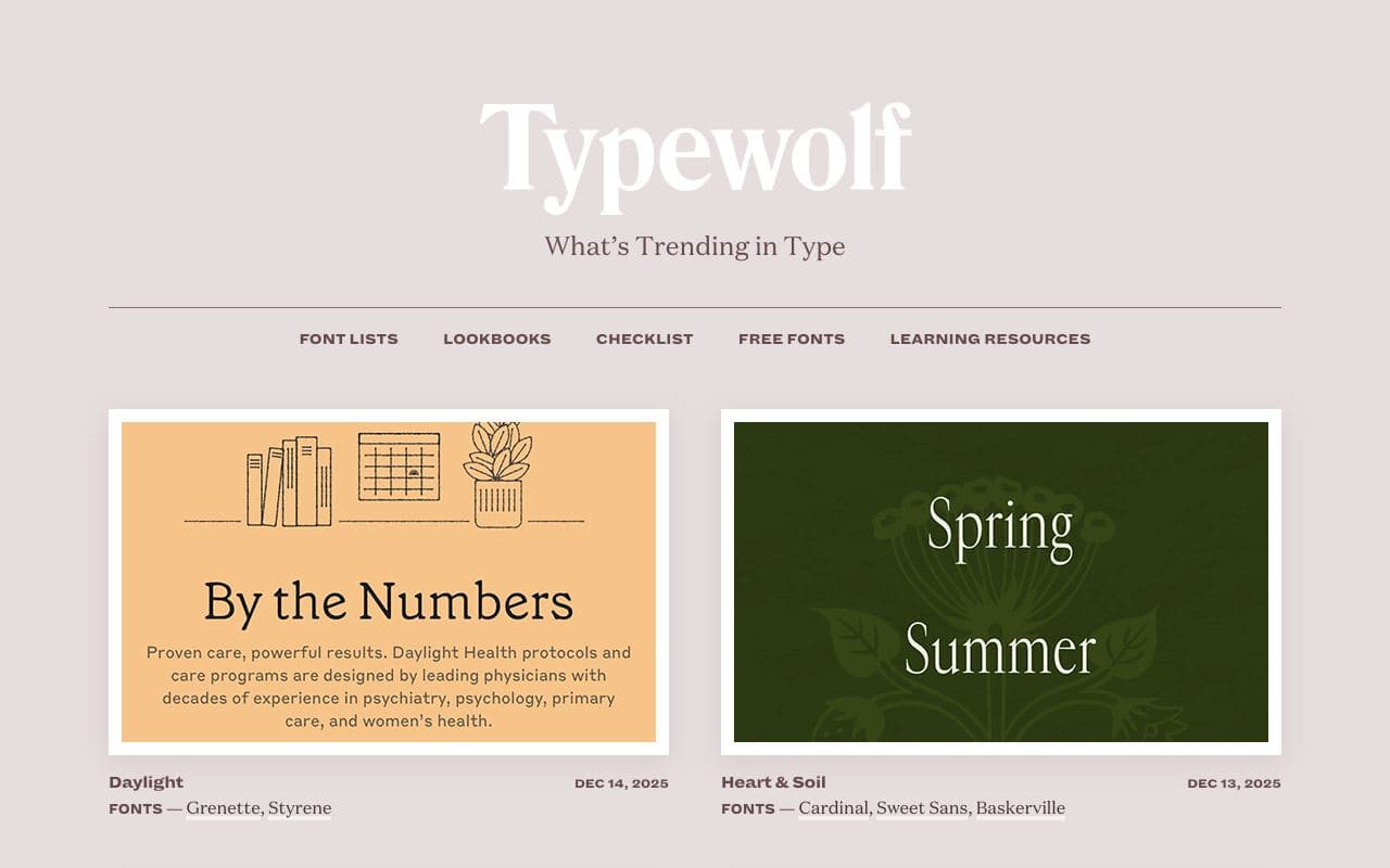
Typewolf
06What's trending in type, with real sites showing each font in use.
limited agent friendlinessWebsiteStaff pickFontsource 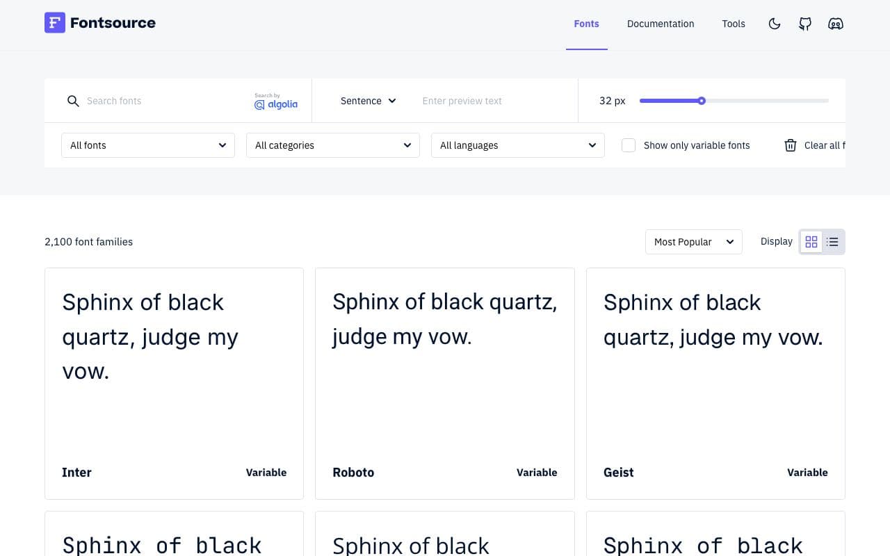
Fontsource
07Self-host any open-source font with an npm install.
excellent agent friendlinessPackageFreeOpen sourceUI Colors 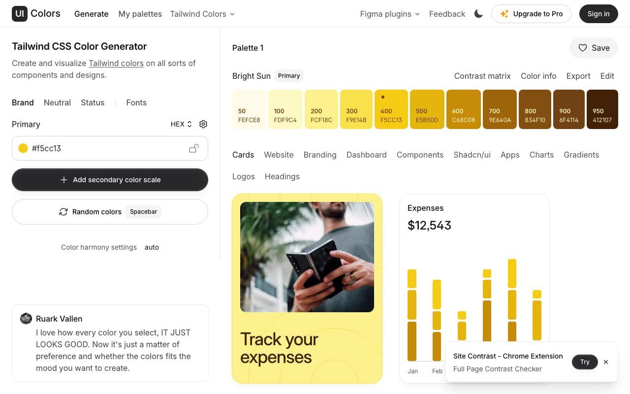
UI Colors
08Turn one brand colour into a full Tailwind-style shade scale.
good agent friendlinessToolFree
What your agent is told
This block goes into AGENTS.md (and CLAUDE.md if you have one). Prefer to paste it yourself? Copy it.
Goes deeper