Pack For people who ship
Restrained SaaS Dashboard
Dense, calm and aligned. The look of a product people use every day.
A contract for admin panels, analytics and anything with tables and charts in it. Greys carry the interface, one blue does the pointing, numbers sit in a mono face so they line up. It borrows the restraint of Linear, Vercel and Stripe without pretending to be them.
Run the install, then build. Tremor gives you charts and stat cards that already match the contract; Origin UI covers the rest of the product surface; Number Flow makes the numbers feel expensive. Read the Geist and Radix Colors pages for why the greys are the way they are. When you think you're done, run the check.
- Type
- Geist + JetBrains Mono
- Colours
- 21 tokens
- Stack
- React, Next.js, Tailwind CSS
- Checks
- /, /dashboard
For agents: this pack as markdown · install manifest
Reference screens
Look at these before you write a prompt, so you’re describing something real. Take the principle, not the pixels.
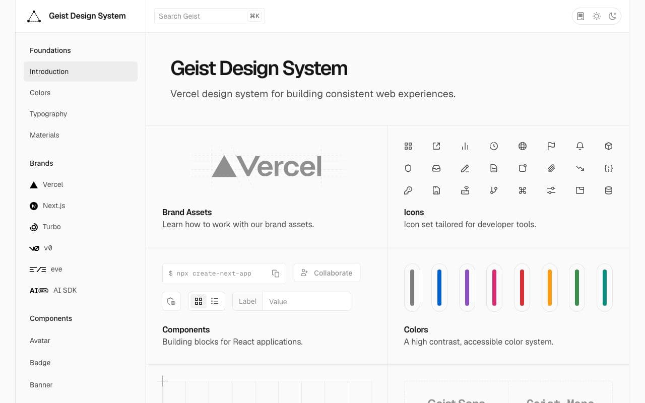
Vercel Geist
How a developer-tool interface stays quiet: one accent, hairline structure, dense but readable type.
Look at: the grey scale and how little colour there is
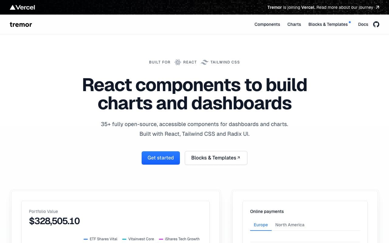
Tremor
Charts and KPI blocks with sensible defaults. This is what the stat row and primary chart should feel like.
Look at: chart palette, axis restraint, stat card hierarchy
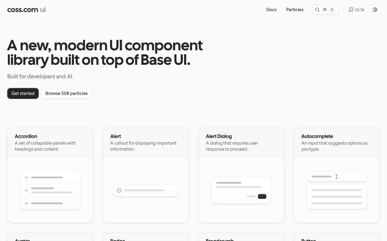
Origin UI
Practical product components: tables, filters, inputs, badges. Less flashy than landing-page kits, which is the point.
Look at: table density, badge sizing, form spacing
The contract
A DESIGN.md on Google’s open format: tokens in the front matter, the reasoning in prose. Your agent reads the whole thing; you can read the summary.
Colours
- paper#fafafa
- surface#ffffff
- surface-2#f4f4f5
- ink#0a0a0a
- ink-2#525252
- ink-3#737373
- line#e5e5e5
- line-strong#d4d4d4
- primary#2563eb
- primary-soft#eff6ff
- on-primary#ffffff
- positive#15803d
- positive-soft#f0fdf4
- negative#b91c1c
- negative-soft#fef2f2
- warning#b45309
- warning-soft#fffbeb
- chart-1#2563eb
- chart-2#0a0a0a
- chart-3#a3a3a3
- chart-4#d4d4d4
Type
- Geisttitle 24px/600 · heading 16px/600 · body 14px/400 · caption 12px/500
- JetBrains Mononumber 14px/500 · metric 28px/500
Spacing
- base
- 4px
- xs
- 4px
- sm
- 8px
- md
- 12px
- lg
- 16px
- xl
- 24px
- 2xl
- 32px
- 3xl
- 48px
- sidebar
- 240px
- gutter
- 24px
Radii
- sm
- 4px
- md
- 6px
- lg
- 8px
- full
- 9999px
Read the whole file193 lines
---
version: alpha
name: Restrained SaaS Dashboard
description: A quiet, dense product interface for software with numbers in it. Greys do the work; one blue does the pointing.
colors:
  paper: "#fafafa"
  surface: "#ffffff"
  surface-2: "#f4f4f5"
  ink: "#0a0a0a"
  ink-2: "#525252"
  ink-3: "#737373"
  line: "#e5e5e5"
  line-strong: "#d4d4d4"
  primary: "#2563eb"
  primary-soft: "#eff6ff"
  on-primary: "#ffffff"
  positive: "#15803d"
  positive-soft: "#f0fdf4"
  negative: "#b91c1c"
  negative-soft: "#fef2f2"
  warning: "#b45309"
  warning-soft: "#fffbeb"
  chart-1: "#2563eb"
  chart-2: "#0a0a0a"
  chart-3: "#a3a3a3"
  chart-4: "#d4d4d4"
typography:
  title:
    fontFamily: Geist
    fontSize: 24px
    fontWeight: 600
    lineHeight: 1.2
    letterSpacing: -0.02em
  heading:
    fontFamily: Geist
    fontSize: 16px
    fontWeight: 600
    lineHeight: 1.4
  body:
    fontFamily: Geist
    fontSize: 14px
    fontWeight: 400
    lineHeight: 1.5
  caption:
    fontFamily: Geist
    fontSize: 12px
    fontWeight: 500
    lineHeight: 1.4
    letterSpacing: 0.01em
  number:
    fontFamily: JetBrains Mono
    fontSize: 14px
    fontWeight: 500
    lineHeight: 1.4
    fontFeature: "tnum"
  metric:
    fontFamily: JetBrains Mono
    fontSize: 28px
    fontWeight: 500
    lineHeight: 1.1
    letterSpacing: -0.02em
    fontFeature: "tnum"
rounded:
  sm: 4px
  md: 6px
  lg: 8px
  full: 9999px
spacing:
  base: 4px
  xs: 4px
  sm: 8px
  md: 12px
  lg: 16px
  xl: 24px
  2xl: 32px
  3xl: 48px
  sidebar: 240px
  gutter: 24px
components:
  button-primary:
    backgroundColor: "{colors.primary}"
    textColor: "{colors.on-primary}"
    typography: "{typography.body}"
    rounded: "{rounded.md}"
    padding: "{spacing.md}"
    height: 32px
  button-secondary:
    backgroundColor: "{colors.surface}"
    textColor: "{colors.ink}"
    typography: "{typography.body}"
    rounded: "{rounded.md}"
    padding: "{spacing.md}"
    height: 32px
  card:
    backgroundColor: "{colors.surface}"
    textColor: "{colors.ink}"
    rounded: "{rounded.lg}"
    padding: "{spacing.lg}"
  stat:
    backgroundColor: "{colors.surface}"
    textColor: "{colors.ink}"
    typography: "{typography.metric}"
    rounded: "{rounded.lg}"
    padding: "{spacing.lg}"
  table-header:
    backgroundColor: "{colors.surface-2}"
    textColor: "{colors.ink-2}"
    typography: "{typography.caption}"
    height: 36px
  table-cell:
    backgroundColor: "{colors.surface}"
    textColor: "{colors.ink}"
    typography: "{typography.body}"
    height: 40px
  badge:
    backgroundColor: "{colors.surface-2}"
    textColor: "{colors.ink-2}"
    typography: "{typography.caption}"
    rounded: "{rounded.full}"
    padding: "{spacing.xs}"
  input:
    backgroundColor: "{colors.surface}"
    textColor: "{colors.ink}"
    typography: "{typography.body}"
    rounded: "{rounded.md}"
    padding: "{spacing.sm}"
    height: 32px
---

# Restrained SaaS Dashboard

## Overview

A product interface for software that shows people numbers: analytics, billing, admin, ops. The feeling to aim for is the one Linear, Vercel and Stripe share: dense but calm, everything aligned, nothing shouting. The user is at this screen every day, so it should get out of the way.

If in doubt, remove something. Dashboards go wrong by addition: one more card, one more colour, one more chart type.

## Colors

Almost everything is grey. The palette has one accent and three status colours, and each of them has exactly one job.

- **Paper (#fafafa) and Surface (#ffffff):** the app background and the panels on it. That single step is the only elevation.
- **Ink (#0a0a0a), Ink 2 (#525252), Ink 3 (#737373):** primary text, secondary text, labels and table headers.
- **Line (#e5e5e5):** every border, divider and table rule. Line strong is for inputs and focused edges.
- **Primary (#2563eb):** the one blue. Primary buttons, active navigation, links, focus rings, the first chart series. If two things on a screen are blue, one of them is wrong.
- **Positive, Negative, Warning:** deltas, status badges, validation. Never decorative, never as backgrounds larger than a badge.
- **Chart series:** blue, ink, mid grey, light grey, in that order. A chart with more than four series needs a different chart.

Dark mode is out of scope for this contract. If you add one, derive it from Radix Colors' grey scale so the steps match.

## Typography

One family for words, one for numbers.

- **Geist** for all text. Titles at 24px semibold with tight tracking; section headings at 16px semibold; body at 14px; captions and table headers at 12px medium with a hint of tracking.
- **JetBrains Mono** with tabular figures for anything numeric that sits in a column or changes over time: metrics, table numbers, timestamps, IDs. Right-align numbers in tables.
- Body is 14px, not 16px. This is a tool, not an article. Never go below 12px.

## Layout

A fixed 240px sidebar and a fluid content area with 24px padding. The content sits on a 4px base scale; components use 8, 12, 16 and 24. Sections separate with 32px, pages with 48px.

Group related metrics in one row of stat cards, at most four. Below that, one primary chart, then the table. Filters and date ranges sit in a single toolbar above the content, right-aligned, never in a sidebar of their own.

## Elevation & Depth

Flat. Cards are surface-on-paper with a 1px line border and no shadow. Popovers and menus get one soft shadow (0 4px 12px at 8% ink) because they float; nothing else does. No gradients anywhere, including chart fills, which are solid at low opacity.

## Shapes

Small and consistent: 4px on badges and checkboxes, 6px on buttons and inputs, 8px on cards and panels. Pills only for status badges. Avatars are the only circles.

## Components

- **Buttons:** 32px tall. Primary is blue with white text, one per view. Secondary is surface with a line border. Destructive uses negative text on a secondary shape, never a red fill.
- **Stat card:** label in caption grey, the number in mono at 28px, a delta in positive or negative with an arrow. No sparkline unless there is room for the axis.
- **Table:** 36px header row in surface-2 with caption text in ink 2, 40px body rows, hairline rules only between rows, numbers right-aligned in mono. Sticky header. Row hover is surface-2.
- **Charts:** Tremor defaults with the series colours above, a single grid axis, no legend when the title already says what the line is.
- **Badges:** pill, surface-2 background, caption text. Status variants use the soft colours with their solid partner as text.
- **Inputs:** 32px, line-strong border, primary ring on focus. Labels above, help text below in ink-3.
- **Empty state:** a short sentence and one secondary action. No illustration.

## Do's and Don'ts

- Do use only Geist and JetBrains Mono. Numbers that align are the whole point of the mono face.
- Do keep every colour inside the palette. When a status needs a colour, use the soft/solid pair, never a new one.
- Do keep contrast at WCAG AA: 4.5:1 for text, 3:1 for icons and borders that carry meaning.
- Do respect `prefers-reduced-motion`; number animations and chart transitions collapse to instant.
- Don't use gradients, glows or glassmorphism anywhere, including chart fills and hero cards.
- Don't put a card inside a card. If content needs grouping inside a panel, use a divider.
- Don't add a rainbow of chart colours. Four series, then rethink the chart.
- Don't use blue for anything that is not interactive.
Resources, in order
Chosen for this contract and ordered the way you’ll need them. Each one says whether your agent can install it or only look at it.
Tremor Tremor
01Copy-paste React components for dashboards and charts.
excellent agent friendlinessComponent libraryFreeOpen sourceOrigin UI Origin UI
02Hundreds of polished, practical components built on shadcn/ui conventions.
excellent agent friendlinessComponent libraryFreeOpen sourceStaff pickNumberFlow 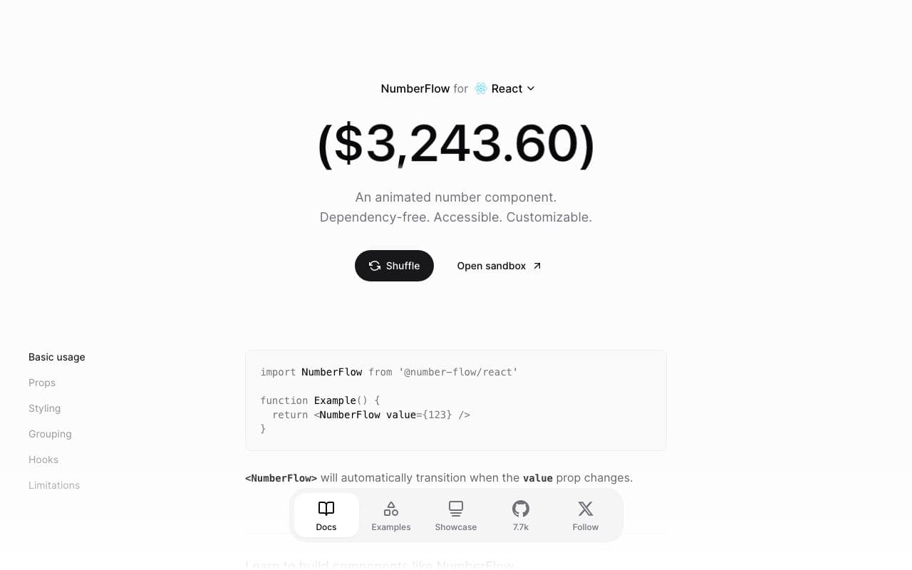
NumberFlow
03Animated number transitions that make counters, prices and stats feel expensive.
excellent agent friendlinessPackageFreeOpen sourceVercel Geist Vercel Geist
04Vercel's design system: the reference for the modern developer-tool look.
good agent friendlinessDesign systemFreeStaff pickRadix Colors 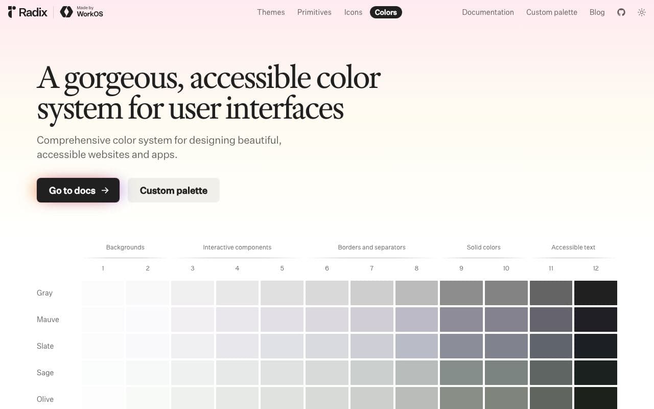
Radix Colors
05Colour scales designed for real UI, with light and dark modes that actually match.
excellent agent friendlinessAsset libraryFreeOpen sourceStaff pickWeb Interface Guidelines 
Web Interface Guidelines
06A concise, agent-readable checklist of what a well-built web interface must get right.
excellent agent friendlinessGuideFreeOpen sourceStaff pickUsed by meshadcn MCP server 
shadcn MCP server
07Let your agent browse, search and install components from any shadcn registry.
excellent agent friendlinessMCP serverFreeOpen sourcePlaywright MCP 
Playwright MCP
08Give your agent a browser so it can see and test what it built.
excellent agent friendlinessMCP serverFreeOpen sourceStaff pickUsed by me
What your agent is told
This block goes into AGENTS.md (and CLAUDE.md if you have one). Prefer to paste it yourself? Copy it.
Goes deeper