ToolTools
Accessible Palette
Build colour scales where every step has predictable, accessible contrast.
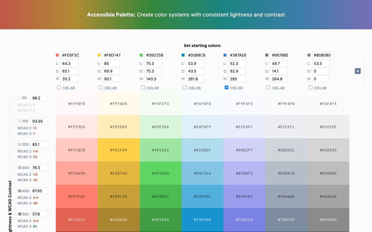
What it is
Accessible Palette generates colour scales using a perceptually uniform colour space, so that the same step number across different hues has the same lightness and the same contrast against white or black. Export as CSS variables or Tailwind config.
Why it’s here
If you want the Radix Colors idea but with your own brand hue, this is how you build it. The lightness-locked steps mean your blue-500 and your green-500 behave the same way as text or backgrounds.
Best for
- building a brand colour scale
- accessible palettes
- consistent contrast
Can my agent use this?
Agent good agent friendlinessPartly. Build the palette in the tool, export the CSS or Tailwind snippet, and paste it to your agent.
Good: Publicly accessible and useful to reference, but the agent will need to interpret it rather than install it.
Access methods
- Public website
- Copy/paste
Related resources
WebAIM Contrast Checker 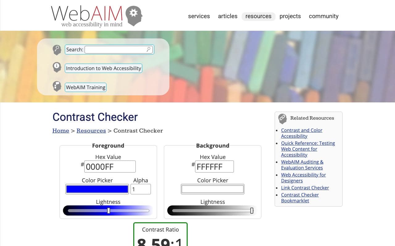
WebAIM Contrast Checker
The reference tool for checking text and background colour contrast.
ToolFreegood agent friendlinessRadix Colors 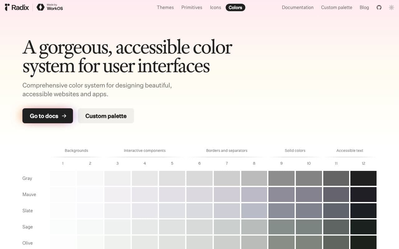
Radix Colors
Colour scales designed for real UI, with light and dark modes that actually match.
Asset libraryFreeOpen sourceexcellent agent friendlinessStaff pickUI Colors 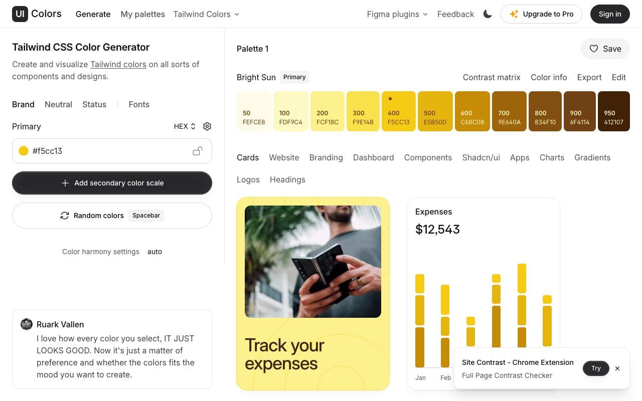
UI Colors
Turn one brand colour into a full Tailwind-style shade scale.
ToolFreegood agent friendlinesstweakcn 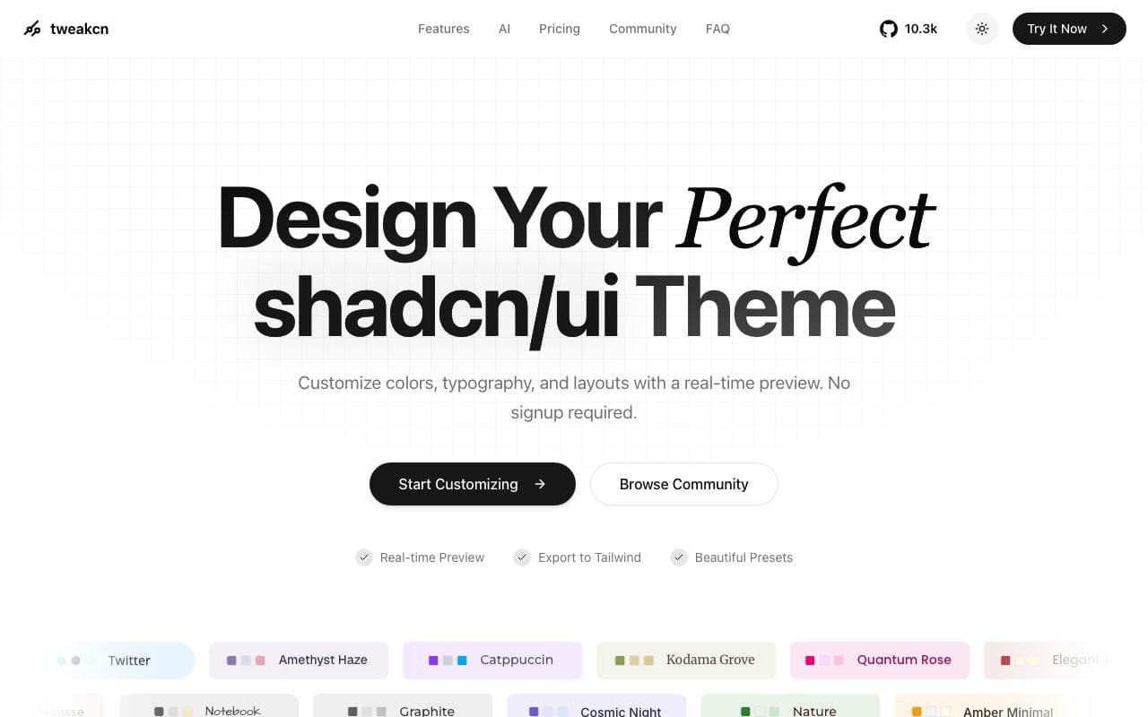
tweakcn
A visual theme editor that makes a shadcn/ui app stop looking like every other shadcn/ui app.
ToolFreeOpen sourcegood agent friendlinessStaff pickUsed by me