ToolTools
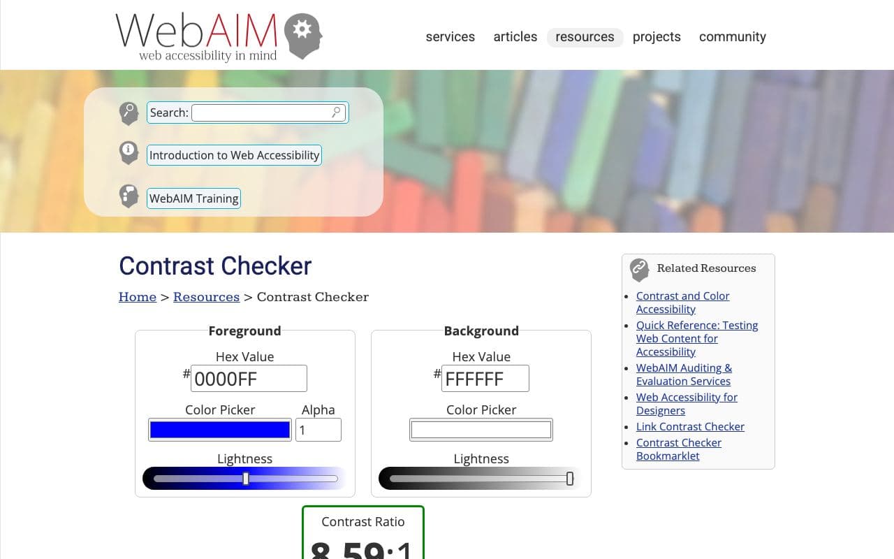
WebAIM Contrast Checker
The reference tool for checking text and background colour contrast.
What it is
Enter a foreground and background colour and WebAIM's checker tells you the contrast ratio and whether it passes WCAG AA and AAA for normal text, large text and UI components. Simple, trusted, and linked from every accessibility guideline.
Why it’s here
Light grey text on white is the most common ugly-and-inaccessible mistake in agent-generated UI. Check your muted text colours here. Aim for 4.5:1 for body text.
Best for
- checking colour contrast
- accessibility compliance
- choosing text colours
Can my agent use this?
Agent good agent friendlinessYes. There's a simple query-string API an agent can call to check two colours. More usefully, tell your agent "all text must meet WCAG AA contrast" and it can compute ratios itself.
Good: Publicly accessible and useful to reference, but the agent will need to interpret it rather than install it.
Access methods
- Public website
- API
Related resources
Accessible Palette 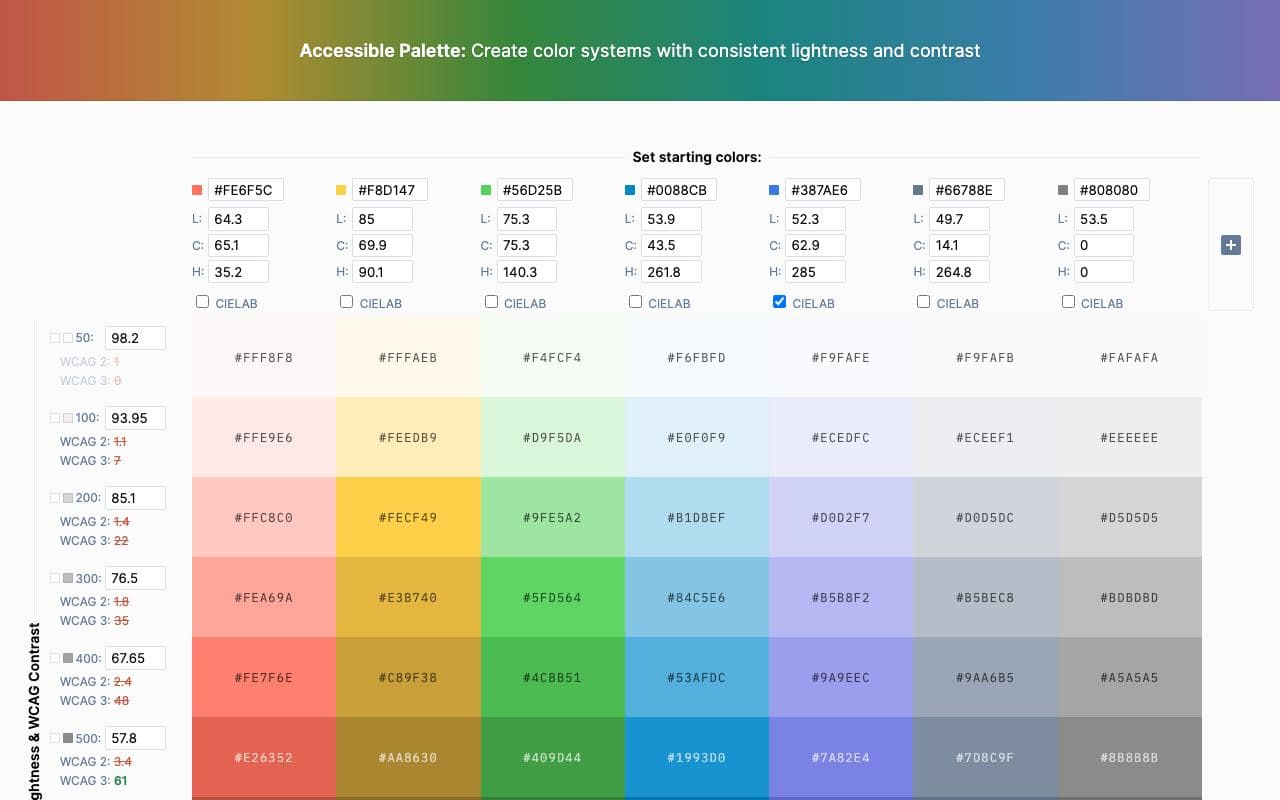
Accessible Palette
Build colour scales where every step has predictable, accessible contrast.
ToolFreegood agent friendlinessRadix Colors 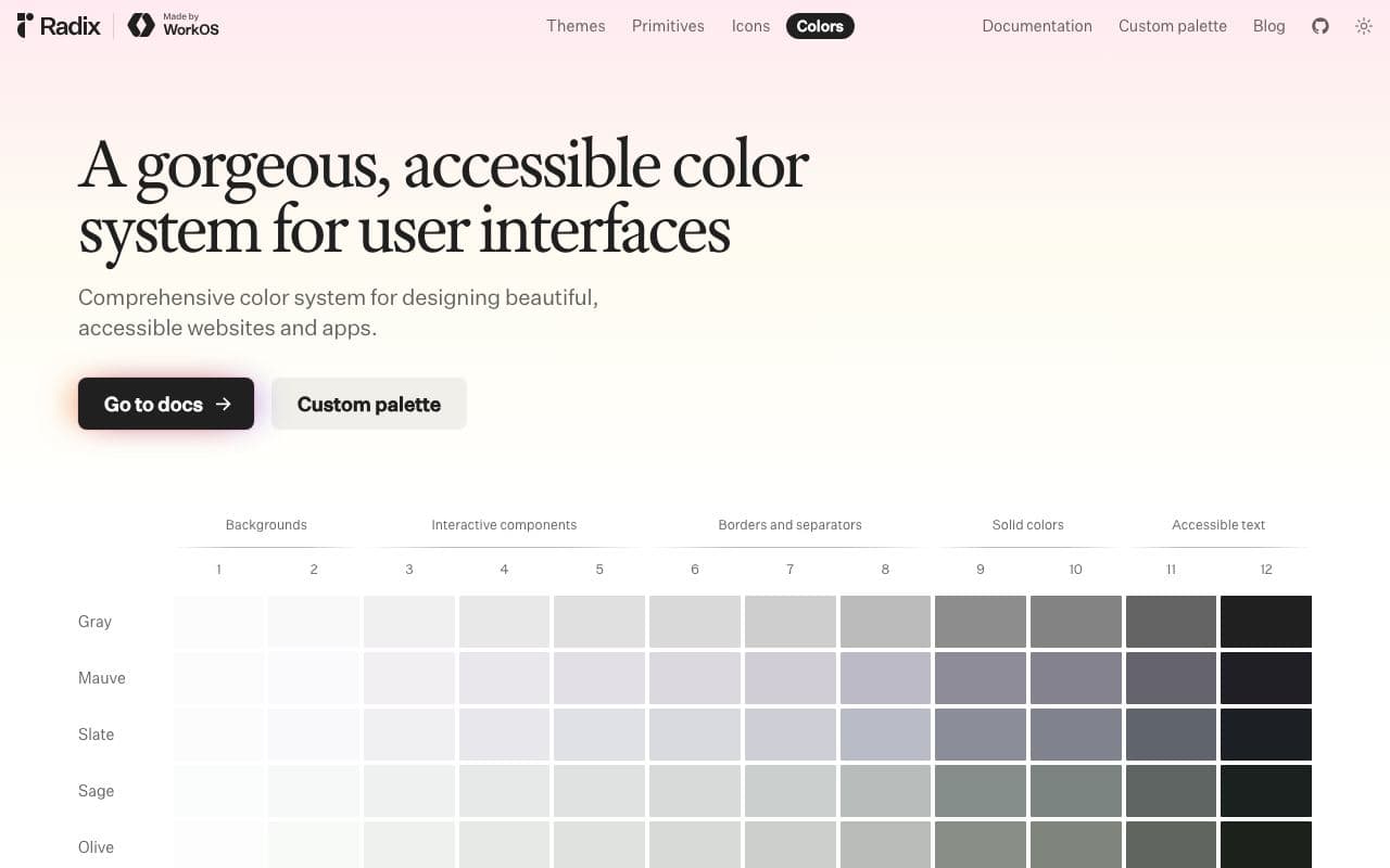
Radix Colors
Colour scales designed for real UI, with light and dark modes that actually match.
Asset libraryFreeOpen sourceexcellent agent friendlinessStaff pickGOV.UK Design System 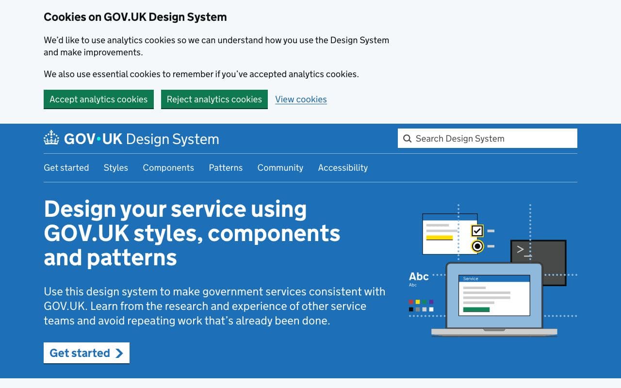
GOV.UK Design System
The gold standard for accessible, plain-language interfaces.
Design systemFreeOpen sourceexcellent agent friendlinessStaff pickRealtime Colors 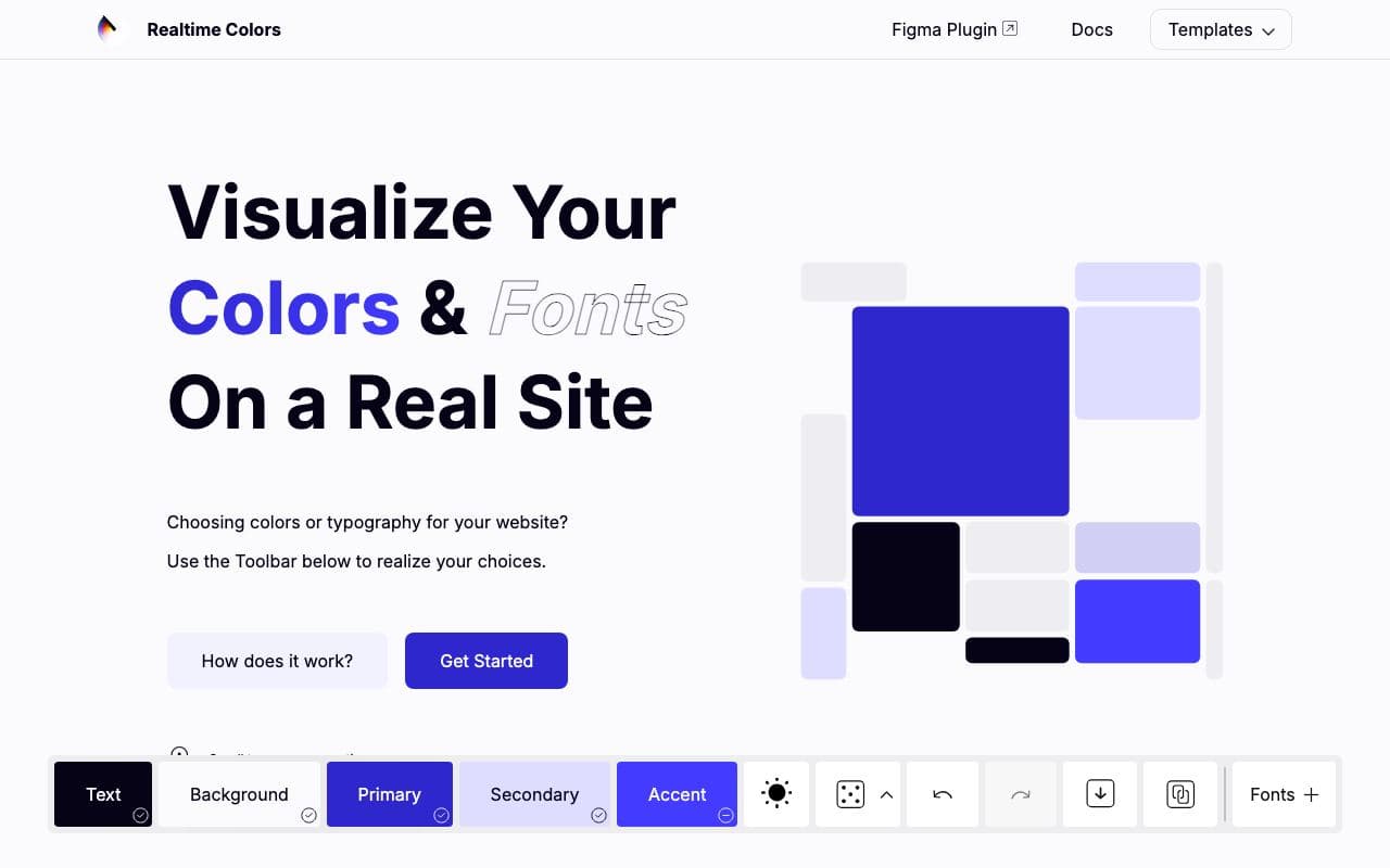
Realtime Colors
Preview a palette and font pairing on a realistic page before committing.
ToolFreelimited agent friendliness