Design systemDesign Systems, Components
Shopify Polaris
Shopify's design system for dense, practical admin interfaces.
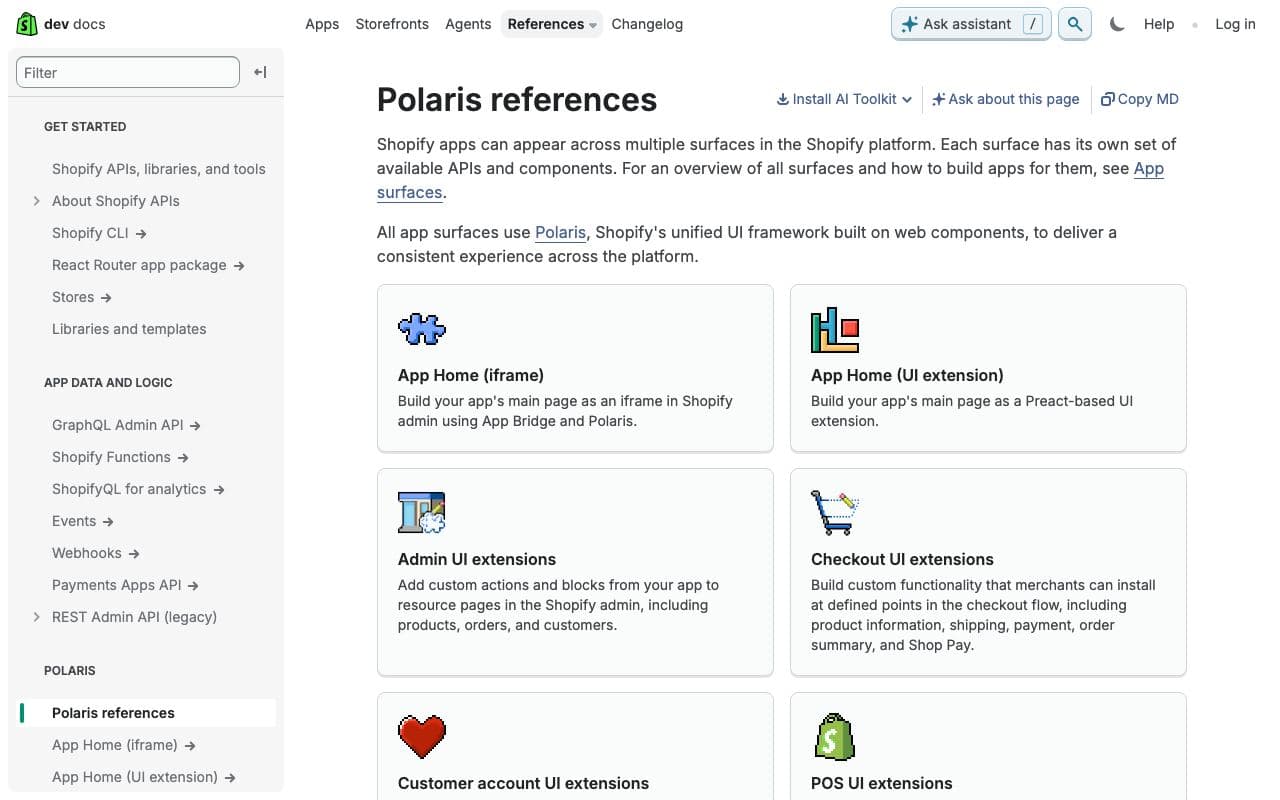
What it is
Polaris is the open-source design system behind the Shopify admin: guidelines, design tokens, and React components tuned for data-heavy merchant tools. It is unusually good at tables, forms, filters and the unglamorous parts of product UI.
Why it’s here
If you're building an admin panel or internal tool, Polaris has already solved most of your layout problems. Even the pattern documentation alone is worth reading.
Best for
- admin panels
- internal tools
- data tables
- form-heavy apps
Can my agent use this?
Agent excellent agent friendlinessYes. Public docs, tokens and source. Ask your agent to follow Polaris patterns for a given screen type even if you're not using the components.
Excellent: Public docs, public source or an installable package. An agent can read, install and implement this directly.
Access methods
- Docs
- GitHub
- npm
Related resources
GitHub Primer 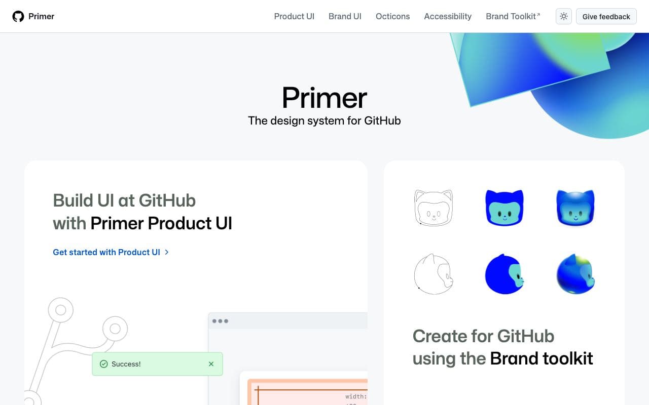
GitHub Primer
The design system that makes GitHub feel like GitHub.
Design systemFreeOpen sourceexcellent agent friendlinessIBM Carbon 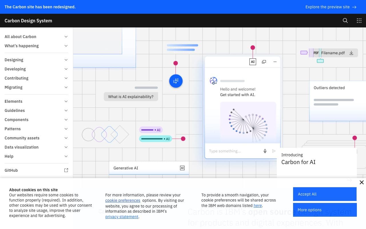
IBM Carbon
IBM's open-source enterprise design system, thorough to a fault.
Design systemFreeOpen sourceexcellent agent friendlinessRadix Themes 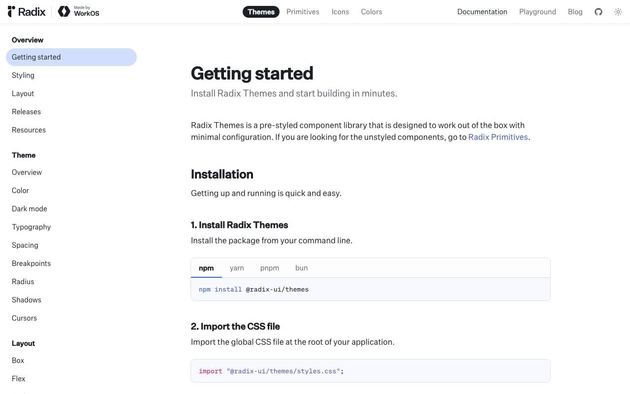
Radix Themes
A styled, themeable React component system from the Radix team.
Component libraryFreeOpen sourceexcellent agent friendlinessOrigin UI 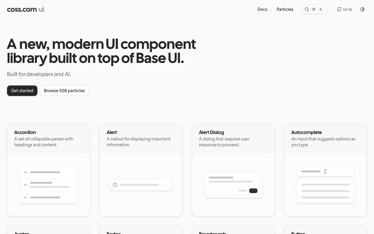
Origin UI
Hundreds of polished, practical components built on shadcn/ui conventions.
Component libraryFreeOpen sourceexcellent agent friendlinessStaff pick