Component libraryComponents, Design Systems
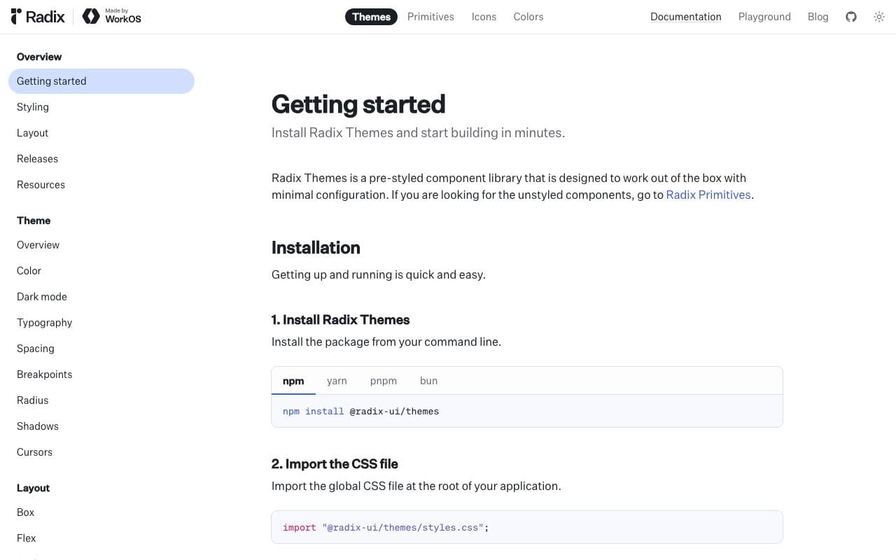
Radix Themes
A styled, themeable React component system from the Radix team.
What it is
Radix Themes is a complete, pre-styled component library built on Radix Primitives and Radix Colors, with a theme panel for adjusting accent colour, radius, scaling and appearance. Unlike shadcn/ui, you install it as a package rather than copying code.
Why it’s here
The best-designed "just install it" React library. The default look is calm and considered, and the theming (especially dark mode) is done properly. A good choice when you don't want to own component source.
Best for
- apps that need a good default look fast
- dark mode
- consistent theming
Can my agent use this?
Agent excellent agent friendlinessYes. Docs, source and npm. Tell your agent the theme settings you want (accent, gray, radius, scaling) and it can configure the Theme provider.
Excellent: Public docs, public source or an installable package. An agent can read, install and implement this directly.
Access methods
- Docs
- GitHub
- npm
Install
npm install @radix-ui/themesRelated resources
Radix Colors 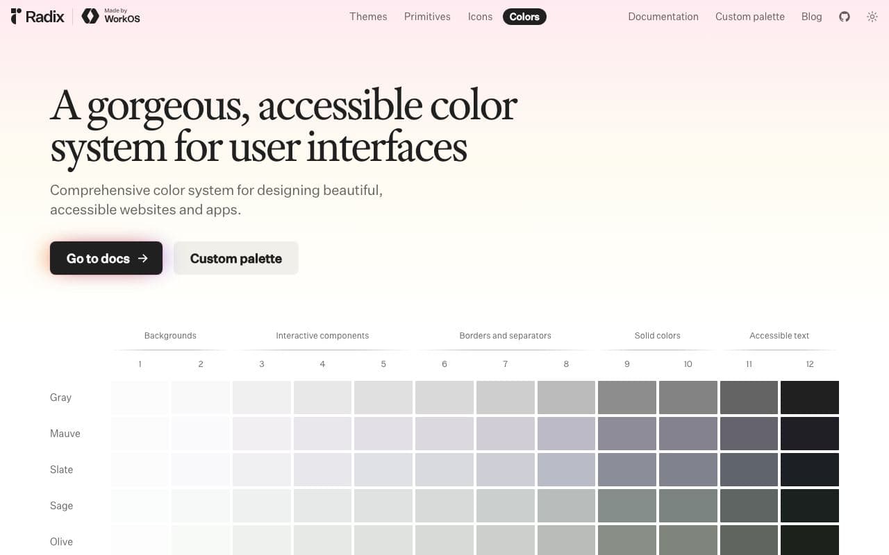
Radix Colors
Colour scales designed for real UI, with light and dark modes that actually match.
Asset libraryFreeOpen sourceexcellent agent friendlinessStaff pickGitHub Primer 
GitHub Primer
The design system that makes GitHub feel like GitHub.
Design systemFreeOpen sourceexcellent agent friendlinessIBM Carbon 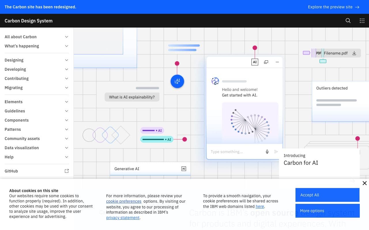
IBM Carbon
IBM's open-source enterprise design system, thorough to a fault.
Design systemFreeOpen sourceexcellent agent friendlinessReact Aria 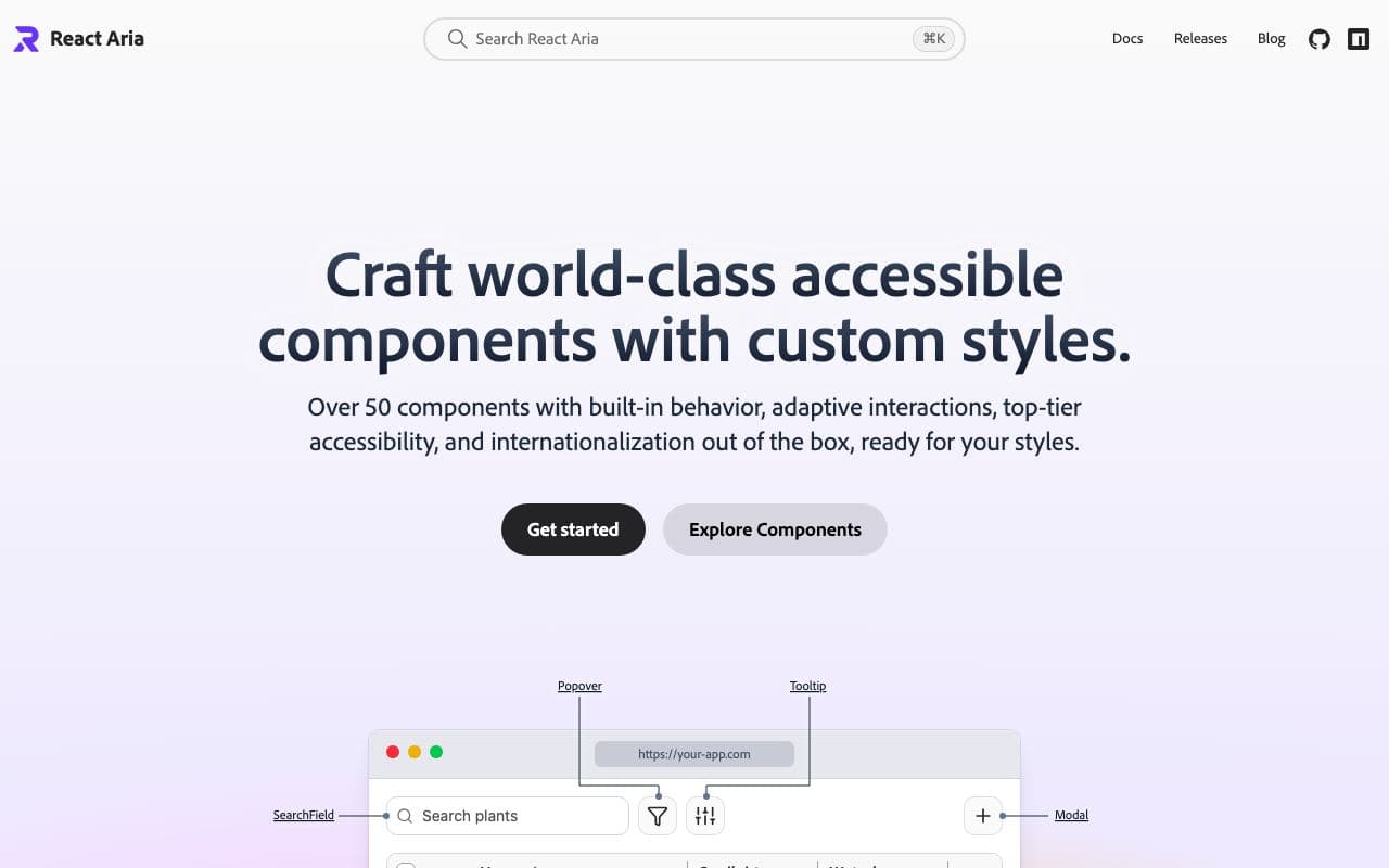
React Aria
Adobe's accessibility-first hooks and components for React.
Component libraryFreeOpen sourceexcellent agent friendliness