Component libraryComponents, Design Systems
React Aria
Adobe's accessibility-first hooks and components for React.
What it is
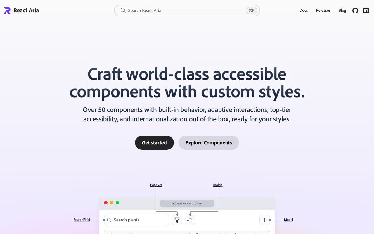
React Aria gives you accessible behaviour, internationalisation and interactions for a large set of components, either as hooks or as unstyled components. It is maintained by Adobe and underpins their Spectrum design system, so it is battle-tested on demanding products.
Why it’s here
The most rigorous option for accessibility. The learning curve is steeper than Radix, but if you're building something where keyboard and screen-reader behaviour has to be right, it's hard to beat.
Best for
- accessibility-critical apps
- date pickers and complex inputs
- design-system foundations
Can my agent use this?
Agent excellent agent friendlinessYes. Extensive docs and examples, public source, npm packages. The docs are long, so tell your agent exactly which component you need.
Excellent: Public docs, public source or an installable package. An agent can read, install and implement this directly.
Access methods
- Docs
- GitHub
- npm
Install
npm install react-aria-componentsRelated resources
Base UI 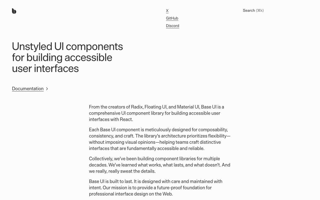
Base UI
Unstyled React components from the people behind Radix, Material UI and Floating UI.
Component libraryFreeOpen sourceexcellent agent friendlinessGOV.UK Design System 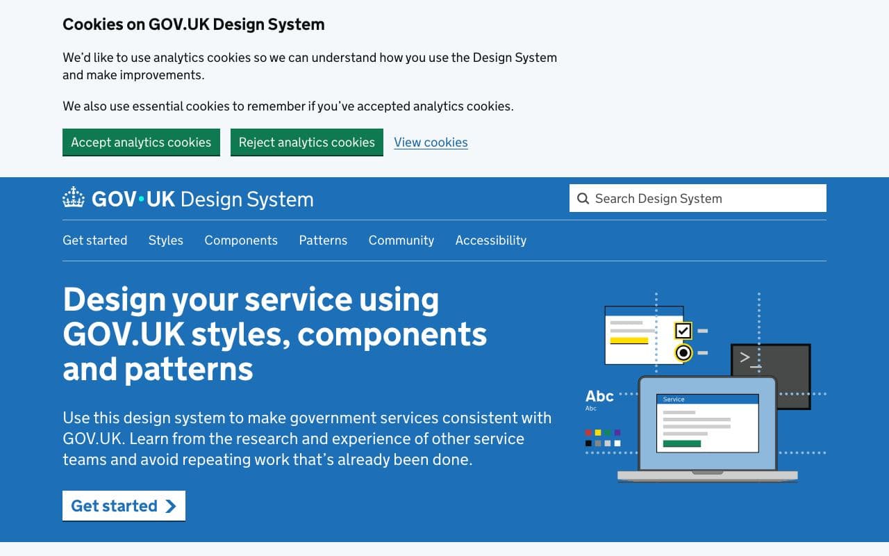
GOV.UK Design System
The gold standard for accessible, plain-language interfaces.
Design systemFreeOpen sourceexcellent agent friendlinessStaff pickRadix Themes 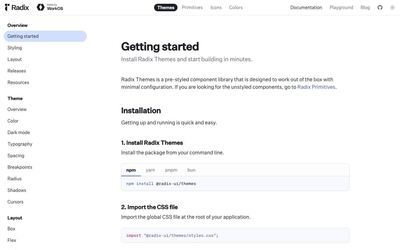
Radix Themes
A styled, themeable React component system from the Radix team.
Component libraryFreeOpen sourceexcellent agent friendlinessArk UI 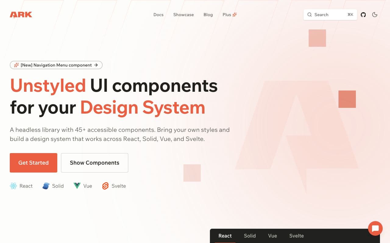
Ark UI
Headless components that work the same in React, Vue, Svelte and Solid.
Component libraryFreeOpen sourceexcellent agent friendliness